The full version of my master’s thesis is found in the booklet.
Landscape driven design
An investigation of a new building typology that seeks to preserve natural landscape qualities in urban contexts
How can landscape characteristics and qualities work as a point of departure in the design process of a densification project in an urban context with the aim of preserving, or even enhancing, cultural ecosystem services?
How can the interface between building and ground be designed to reduce the impact on site and preserve or even enhance pedestrian mobility and experience?
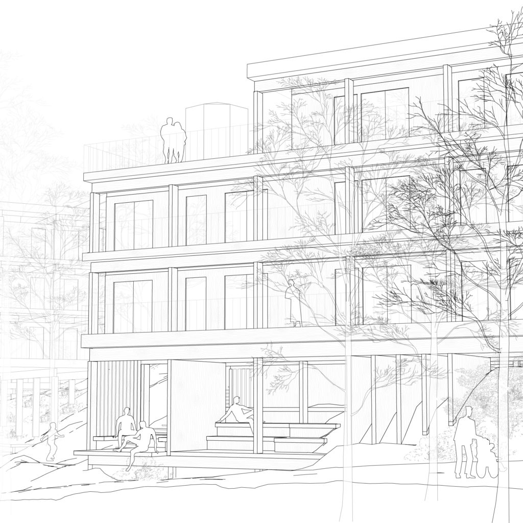
The larger cities in Sweden are growing and densification is considered a sustainable method for societal development that counteracts urban sprawl and thereby exploitation of landscapes and agricultural land outside the cities. But there are a lot of challenges with densification such as loss of green spaces.
In today’s building industry, natural urban green spaces with little or no interference from infrastructures and buildings are exploited with little concern to the site. Natural landscape features and characteristics, such as biodiversity, terrain and topography, vegetation, spatial patterns and elements, human recreation, and visual qualities, vanishes in the process of urban densification.
To ensure a sustainable green infrastructure it’s important where new buildings are developed. Already exploited areas, such as parking lots, are to prefer oven virgin land. But sometimes green spaces are the only areas available. The aim of this master’s thesis is to explore an alternative and more sustainable building typology and design approach for urban densification of green spaces that seeks to preserve natural landscape qualities.
The thesis results in a design proposal of a residential complex at an unexploited site in Lunden, Gothenburg. Emphasis lies in research by design where different landscape analysis methods are used and explored as design tools in an iterative design process. Case studies were used for obtaining more knowledge of how landscape characteristics can be approached in a design process with focus on spatiality, visual effects, terrain form, and vegetation. Research about building foundations with minimal impact on the ground was used when exploring spaces generated in the interface between building and ground.
Choosing site
The site for the design proposal was chosen upon several criteria:
- Urban context in Gothenburg
- A too a large extent unexploited natural area
- Low recreational and pedestrian use
Green spaces that already have a good recreational use shouldn’t be exploited, but green spaces with tough terrain could be made accessible by a built structure.
The site for the design proposal didn’t require an extraordinary nature and character. The “every-day nature” and how such areas can be developed in urban contexts were in focus. Places without extraordinary and magnificent features still have qualities and values from being a place of greenery in an urban context.
Lunden is a larger area in eastern Gothenburg with multiple areas that meet these demands. After investigation of several areas, a green space at the site of the water tower was chosen.
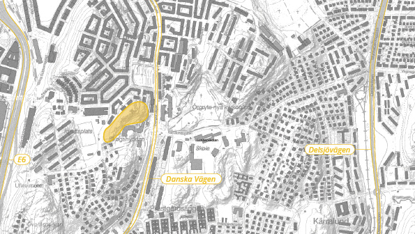
The site
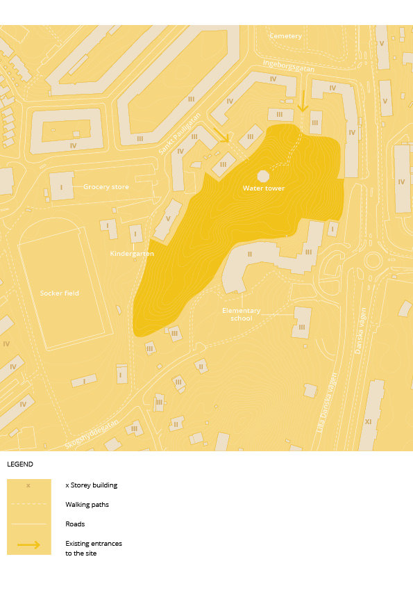
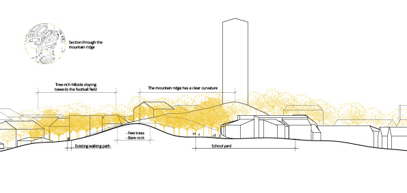
The site is rocky and have a terrain with large height differences. Some places on the site have long views over Gothenburg. Due to the tough terrain and poor pedestrian mobility, the area isn’t used for recreation in form of recreation paths etc. The only paths on the site are the two stairs that leads up to the water tower. Maybe the pedestrian mobility and the attractiveness of the area can be improved by a built structure and thereby encourage physical activity and time spent in nature.
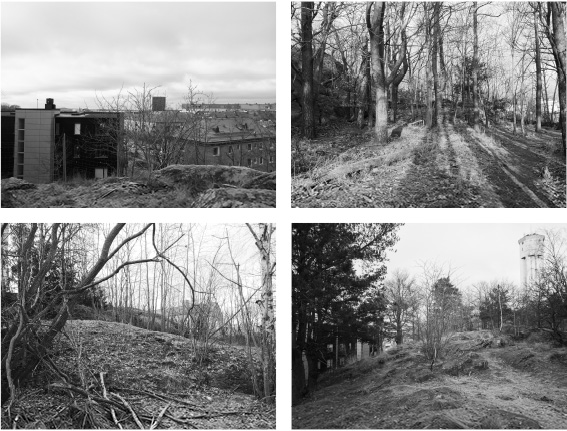
The landscape of the site is characterized by the long mountain ridge and the tree-rich hillsides that surround the ridge.
Movement on the site
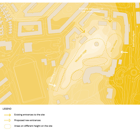
The only walking paths today on the site are the stairways leading to the water tower. In order to make the site a part of the urban fabric, it should be two available entrances to the area places so as much as possible of the landscape will be experienced when passing through. The walking path west of the site and Danska Vägen east of the site are natural entrances. The east hillside, towards Danska Vägen, is quite steep but accessibility could be solved with a long ramp or an outdoor elevator that could be incorporated in the design of the built environment.
As already mentioned, the site has large height differences which has to be considered when designing for pedestrian mobility. The site could roughly be divided into the quite homogeneous inclining and wide hillside on the east part and the mountain ridge on west side. If buildings are places on both these areas, it’s important investigate how there areas are connected.
Volume studies
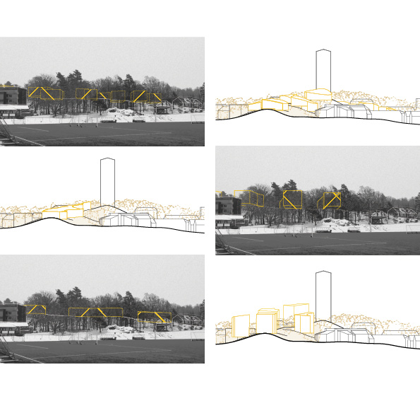
Several volume studies were made with the aim of generating design strategies concerning the larger scale of the design proposal and its effects on the landscape picture. Some illustrations from the volume studies are showcased below.
Design strategies from volume studies
Spatial analysis
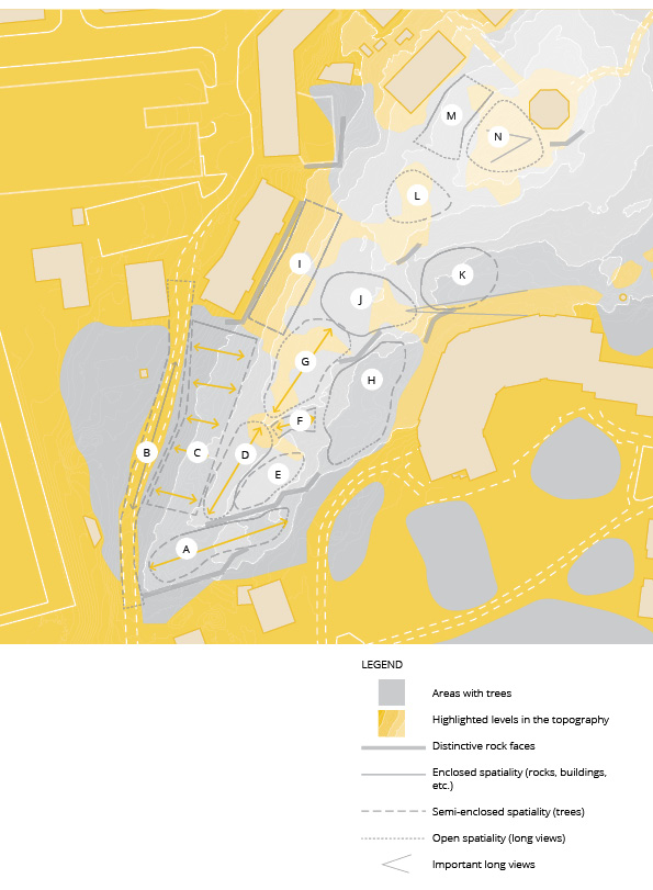
The site for the design proposal was analyzed with maps and site visits. The established landscape analyzes serial vision analysis and figure ground analysis were used and are visible in the map above. The spaces A to N with different spatial character emerged in the spatial analysis. I have called the space J “The Lagoon” since it’s shaped like a bowl and has a feeling that you are in nature, separated from the noisy urban environment.
The design proposal
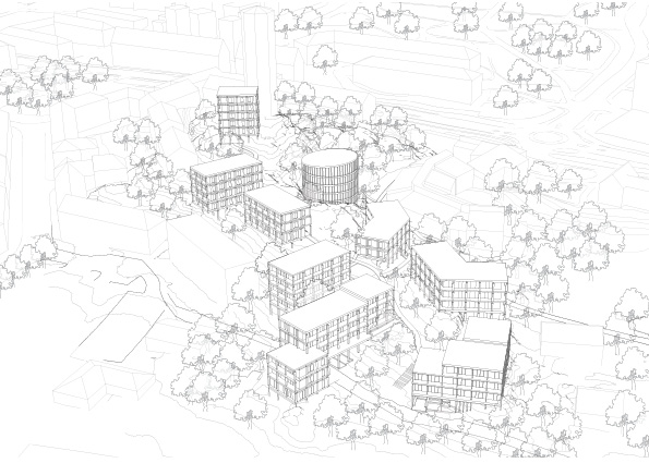
All the buildings in the design proposal have a visible wooden construction that generates a light expression even though the building volumes are quite compact. Since there are few and compact volumes instead of many small ones, larger tree rich nature areas are left available between the buildings than can be enjoyed both by residents in the area and pedestrians visiting.
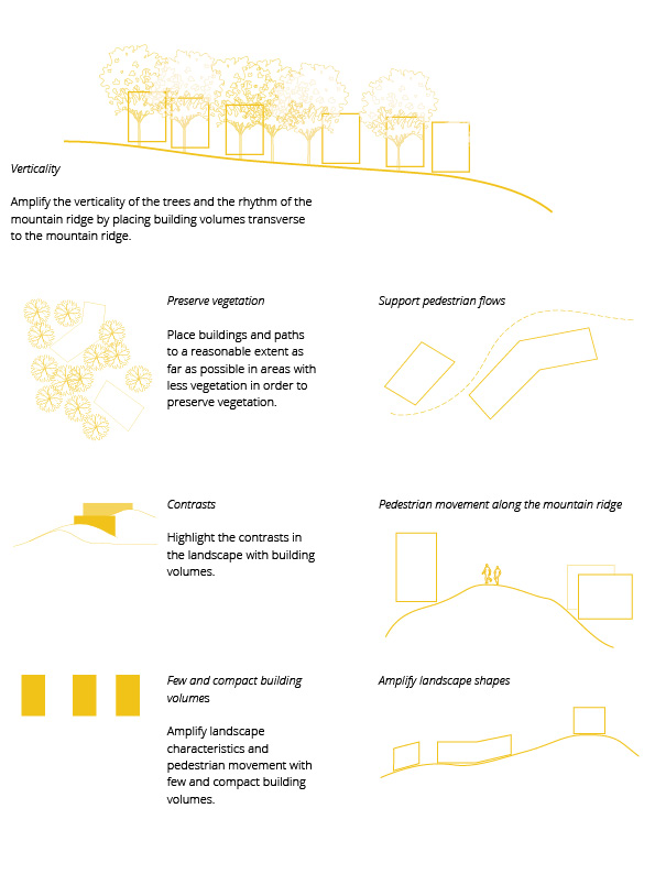
The site is accessible for pedestrians via ramps that generates a nature experience along the mountain ridge. The building volumes are placed transverse to the mountain ridge in the south part of the site, strengthening the verticality and the rhythm of the mountain ridge. Since gables instead of long facades meet the promenade along the ridge, nature is constantly present, mixed with the build structure.
Site plan
Several design strategies were developed from the spatial analysis.
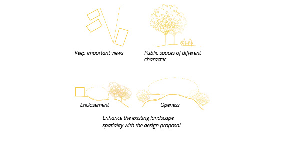
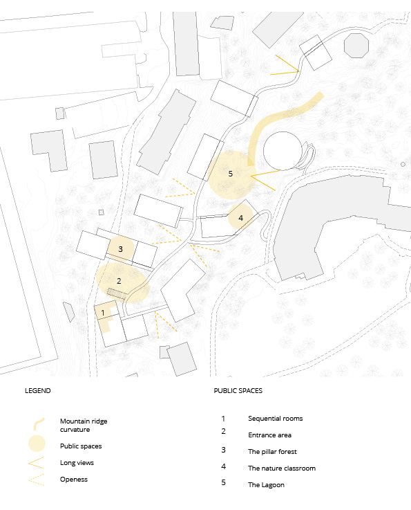
Volumes and facades strengthening landscape characteristics
This view from the socker field overlooks the west part of the design proposal. The entrance area opens up, welcoming people to take the promenade along the mountain ridge. The height of the buildings aligns with the treetops, making the built structure harmonize with the nature instead of competing with it.
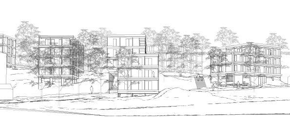
Entering the site
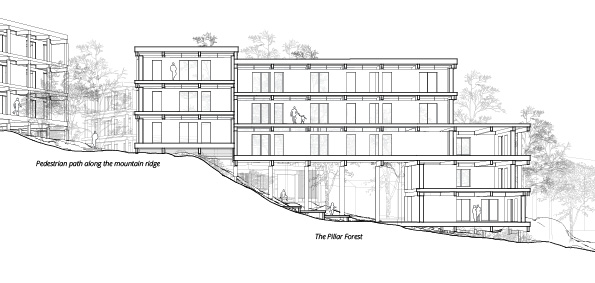
The Pillar Forest
The public space called The Pillar Forest has a wooden staging that gives the opportunity to have small performances or Christmas markets under roof.
Accessibility
The largest height difference to deal with in the pedestrian accessibility is the one between the mountain ridge and the path going through The Pillar Forest. In order to avoid a large and invasive ramp on the hillside in the entrance area, accessibility is managed via the building that bridges over The Pillar Forest.

The pillar forest
There is a small horizontal distance between the glulam pillars and the wooden deck, generating the expression that the pillars are rooted in the ground, just as trees. It also creates a distance from the water runoff from the wooden deck and the glulam pillars.
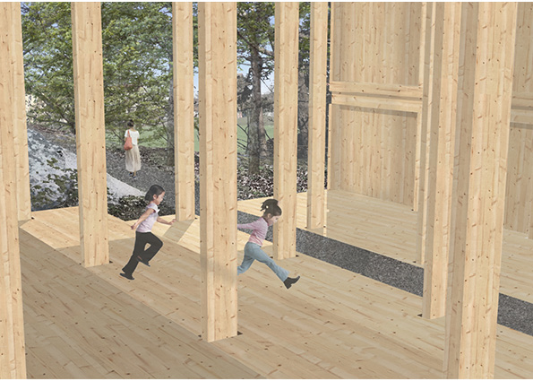
Wooden construction
The master’s thesis design proposal has a visible construction, showcasing the glulam elements. A stilt construction needs to have a diagonal support to take up wind forces from the sides. In the design proposal, glulam wooden boards are used instead of diagonal wooden skews or steel crossbars. The glulam boards align with the vertical form language and are used as room defining elements in the spaces generated in the interface between building and ground.
The cross sections of the glulam bearers and pillars are perpendicular to each other, generating a light feeling in the construction that continues in the entire facade.
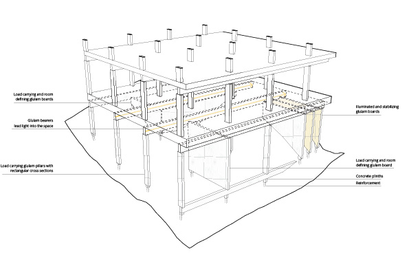
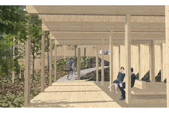
Sequential rooms
This view overlooks the public space called “Sequential Rooms”, situated in the interface between building and ground. To the right, close standing wooden boards light up the otherwise dark space. To the left, the spatiality opens, offering seating places in two different semi-open rooms. The three different spaces are experienced as sequential rooms with different character as walking by. The horizontal beams together with the vertical pillars create a square form language that harmonizes with the existing buildings in the surroundings.

Wood meets rock
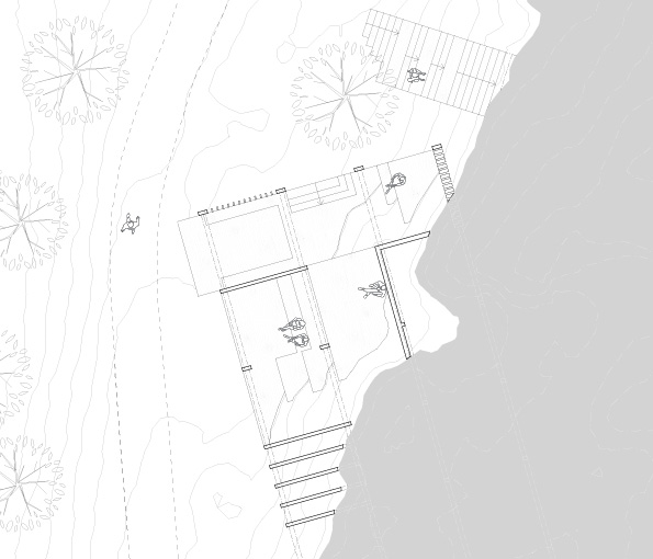
This drawing illustrates a horizontal section through the Sequential Rooms. To make the otherwise quite deep spatiality under the building lighter and more welcoming, wooden boards are placed as room defining elements together with the rocky terrain. The space to the north is elongated and its spatiality connects to the stair that leads up to the mountain ridge.
Wooden landscape
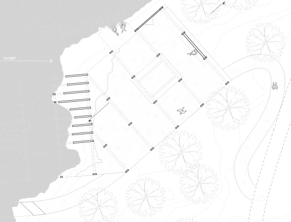
This view overlooks the public space called “The Nature Classroom”. The pedestrian movement on the site is integrated in the wooden space, making it more public and welcoming. Similar to the Sequential rooms, illuminated wooden boards are used to make a contrast to the dark rocks. This space could be used as a nature classroom, both for children in the school next to this space, but also by the public.
The nature classroom
The gap between the rock wall and the building makes the rock wall in The Nature Classroom light up by the sun in the afternoon. The space under the west part of the building isn’t high enough for a human to stand there, but high enough to feel dark and unpleasant if it isn’t dealt with. Illuminated wooden boards are used placed to make this space more shallow and lighter.
Framing the rock wall
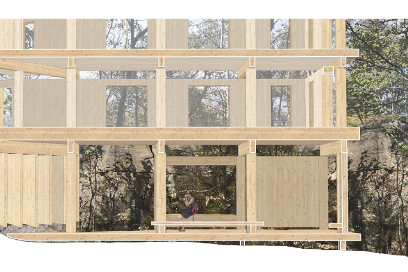
The rock wall is illuminated by the sun in the afternoon and the wooden construction frames the rock, making it look like a painting. The stabilizing wooden boards rest lightly on concrete plinths.
The light feeling in the wooden construction continues in the floors above. Glazed sections in the top of every floor let the viewer experience how the glulam bearers continue through the entire building.
The Lagoon
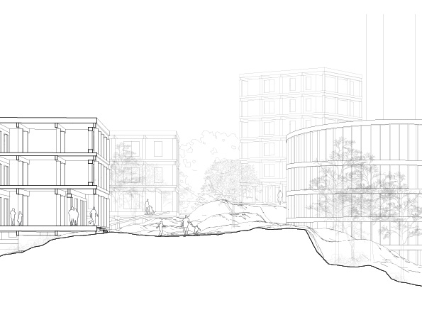
This space is a more nature characterized public space than the entrance area. The enclosed spatiality from west is strengthened by a building volume that integrates the pedestrian path in the structure. The first floor is public and can be used for workshops or home offices for residents. The curvature of the mountain ridge is amplified with the round building volume east of the ridge.
Reflections
In the design proposal, all the spaces generated in the interface between building and ground were public and integrated in the pedestrian path on the site. There were no courtyards for the residents since the intention was to open up the landscape for both residents and visitors. If I would have had more time, I would have liked to investigate this further. How would it work to have all these spaces public? And what kind of events and social activities could these spaces be used for?
I decided early in the master’s thesis process that I wanted to investigate how the design proposal could be developed without having any car roads. I focused on the pedestrian mobility and accessibility. Maybe it wont be necessary to have car roads every where with future technology and solutions? Maybe the accessibility of fire brigades, waste management, etc, could be solved in another way that doesn’t exploit the ground as much? I believe this is an important and interesting question that should be investigated further.
This master’s thesis could be considered as one small step in exploring how urban densification could be made with a more sustainable building typology. I believe the subjects is important and relevant for architects to explore further.