Design proposal – telling tales of movement
Now the toolbox was complete with Travelling threads, Gravity, Shape rule and overlay mapping and ready to be tested on site.
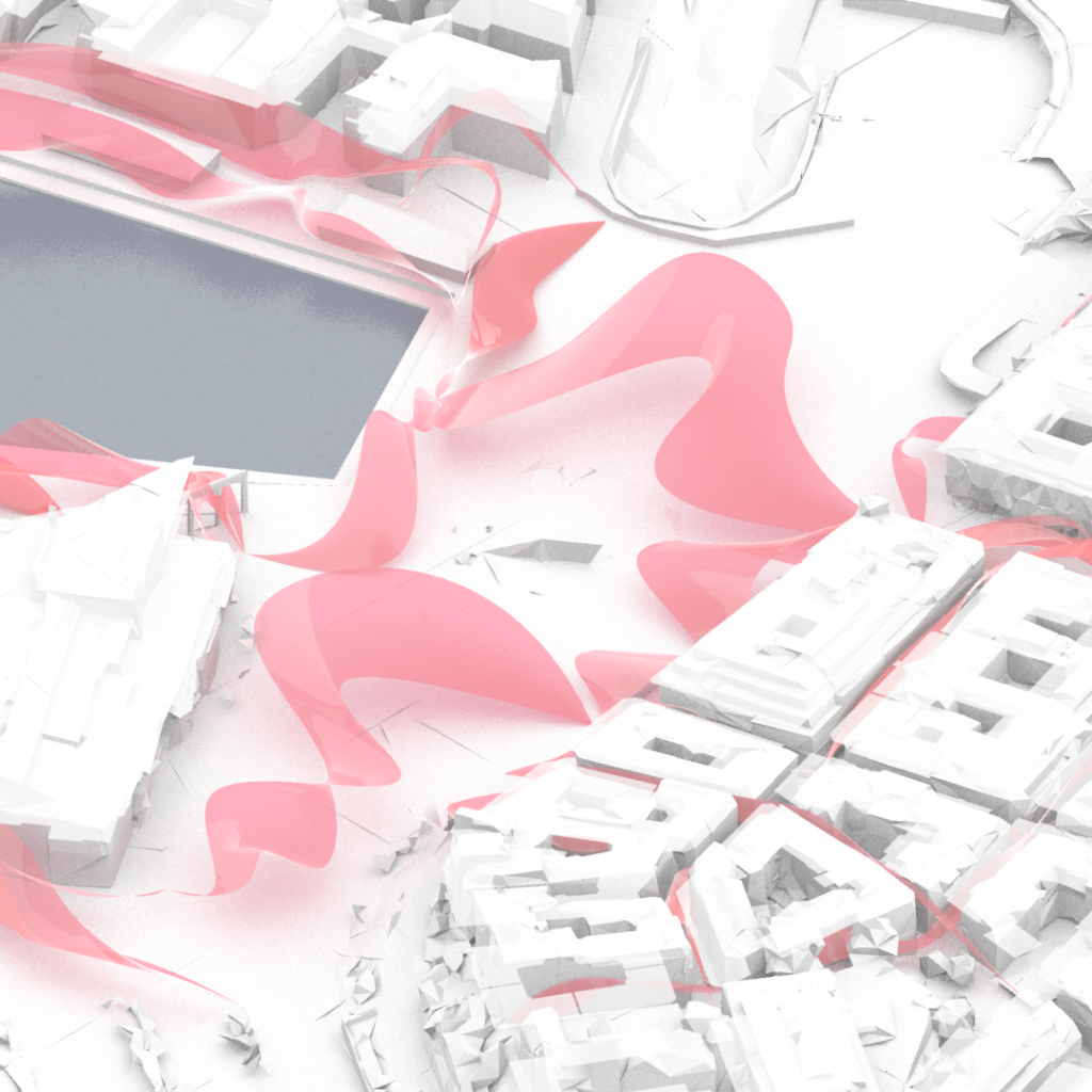
The illustration shows the existing public spaces at Kanaltorget and an analysis of movement. The threads indicate that there exists a majority of bigger open spaces of the same kind with a low flow horizontally.
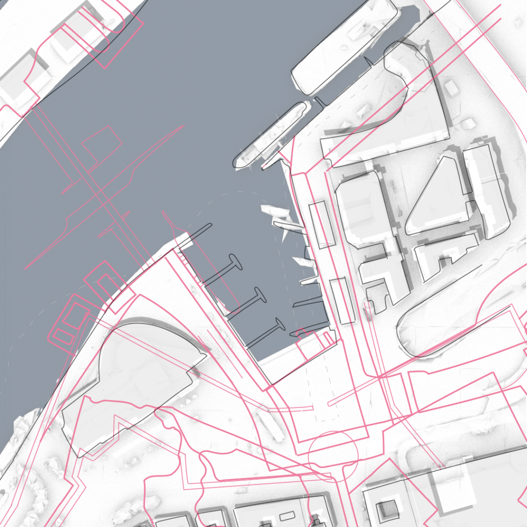
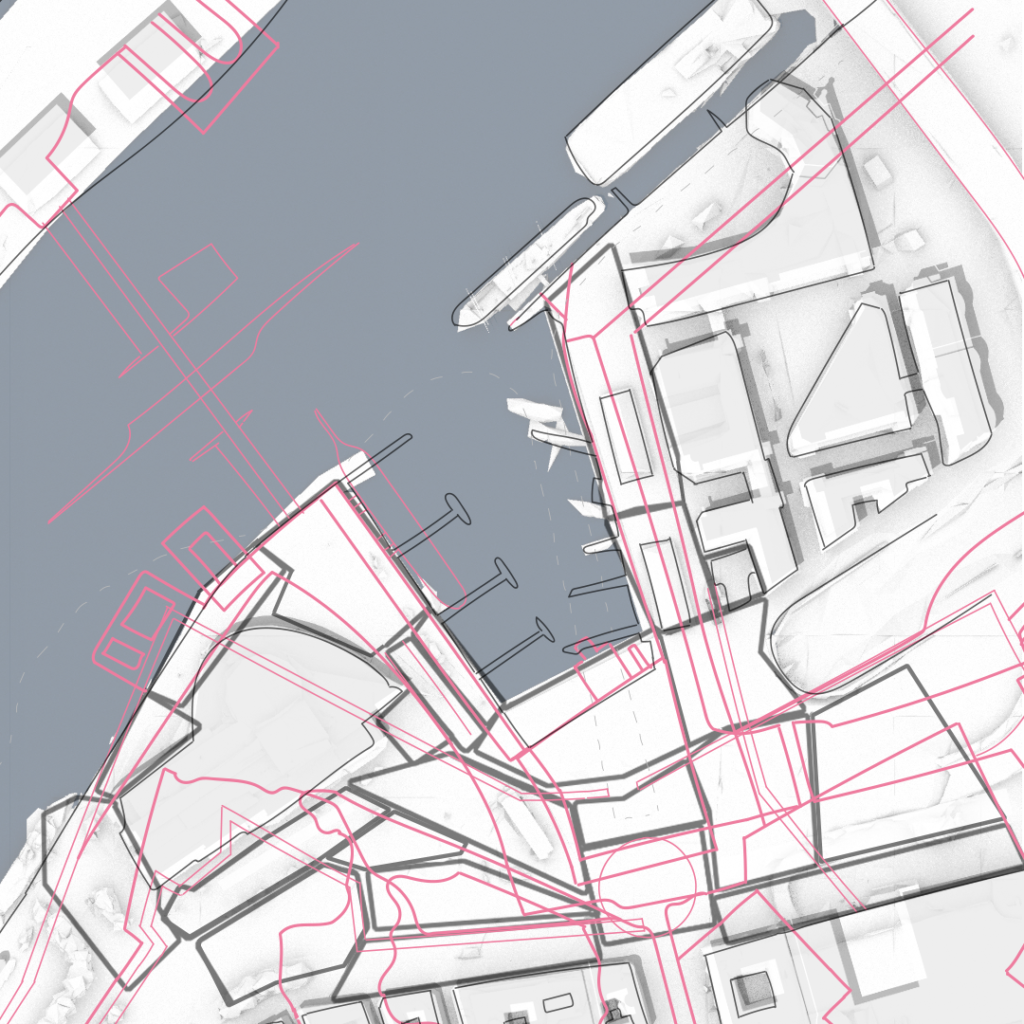
Looking at the result of the layers of the historic motion on site, the pink lines are imagined as potential extrusions and clearings, which helps us to divide the spaces in smaller shapes for a first draft.
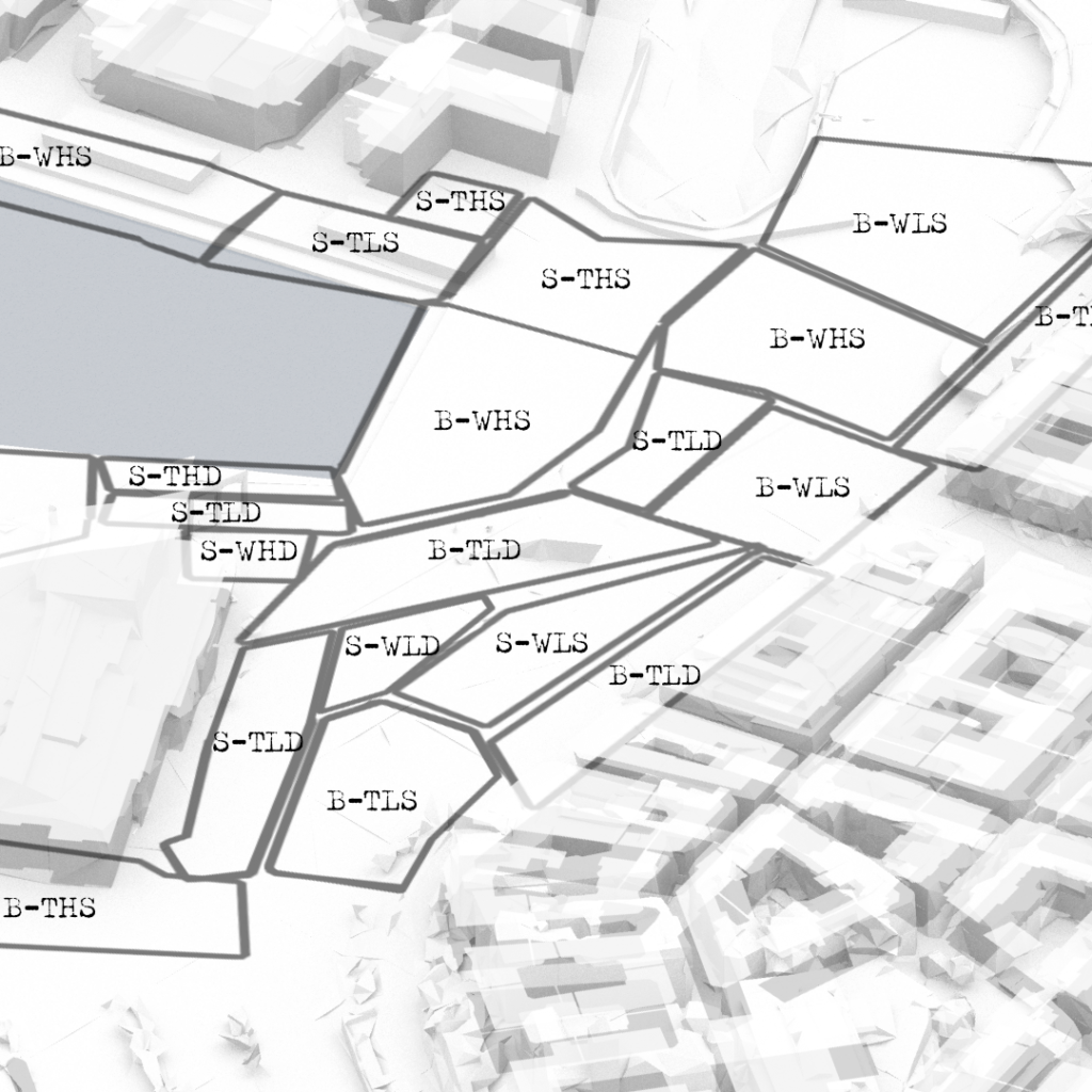
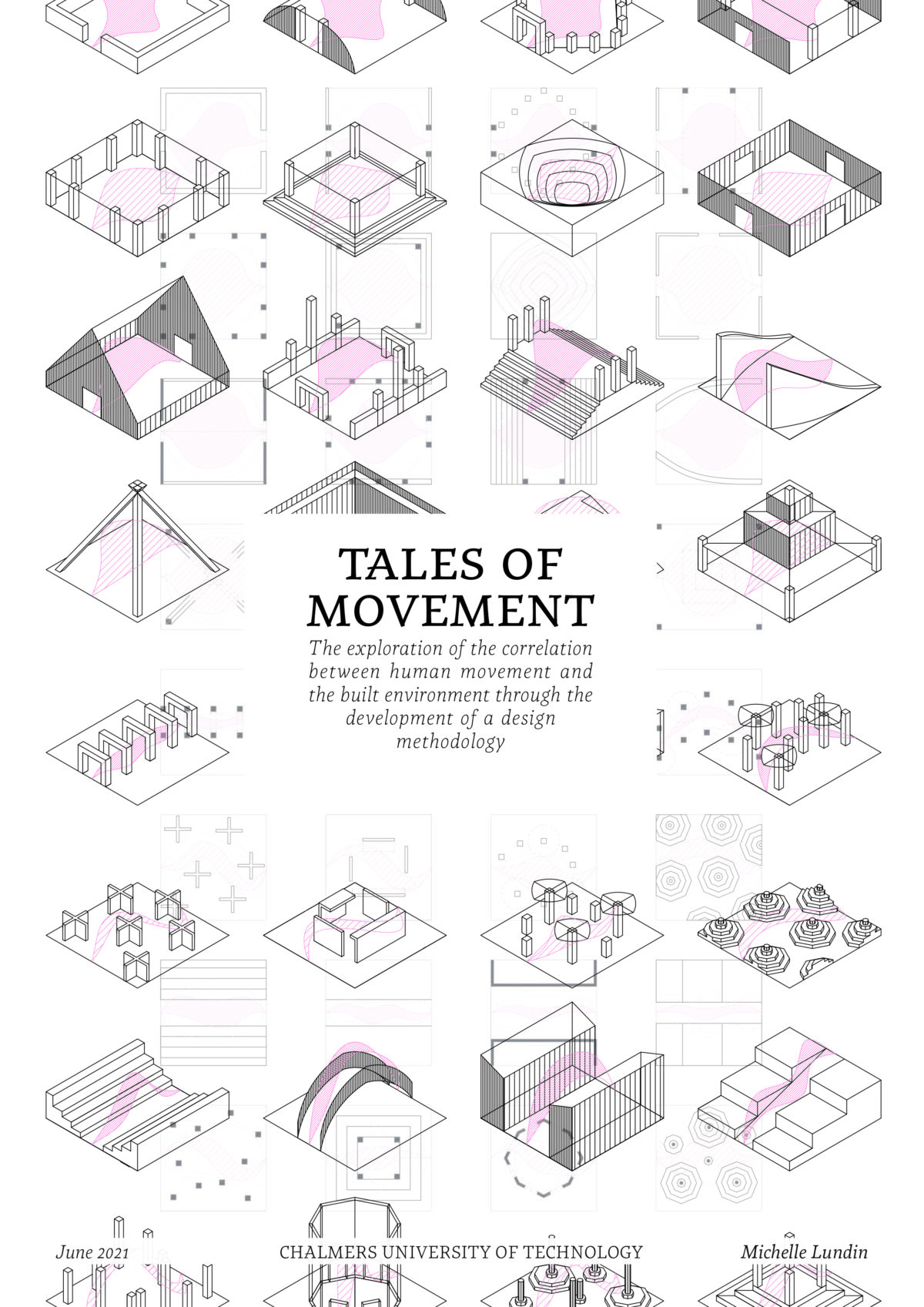
In this first design the main aim is to test the toolbox and create a variety of spaces in order to see what different kinds of movement generates on site and where there might arise problems. The coded spaces were placed haphazardly, only following the parameters of representing all the different variations of spaces, as well as if it is a big or small space and thin or wide?
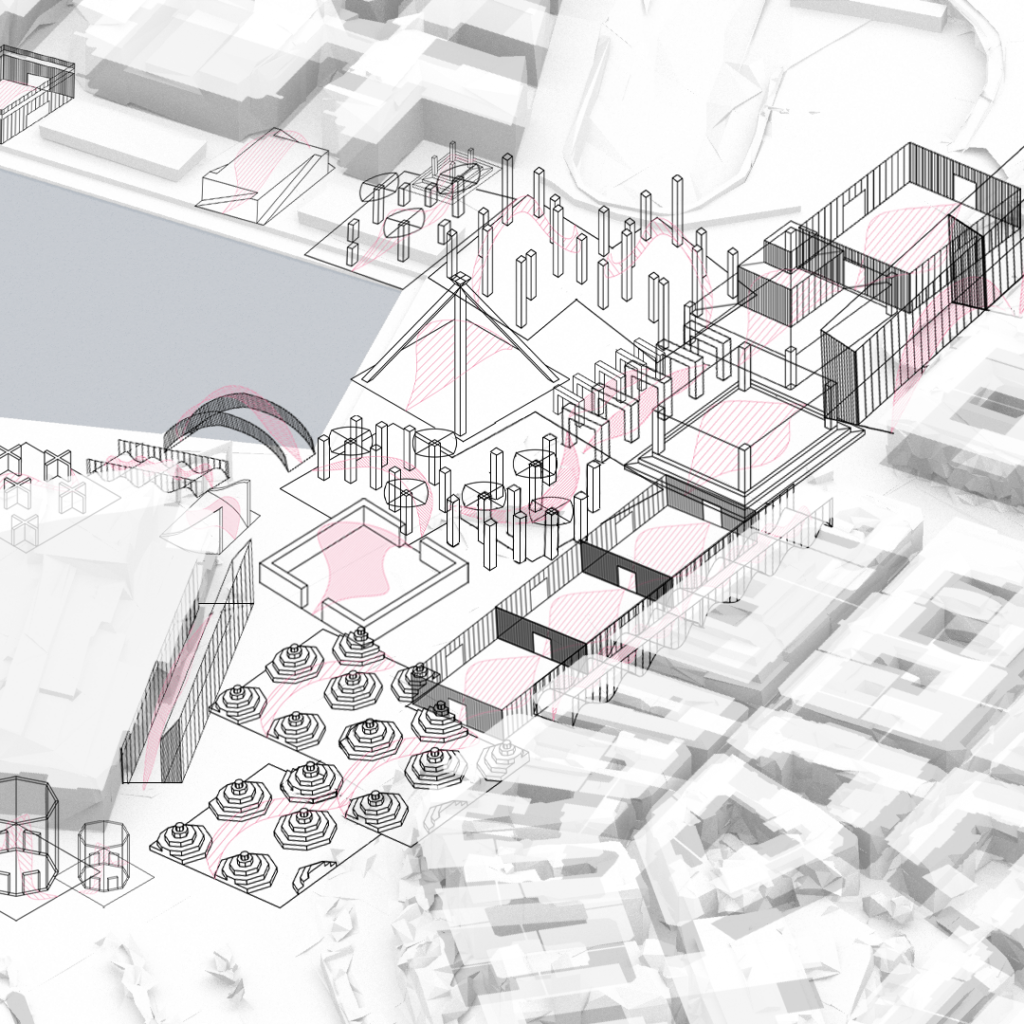
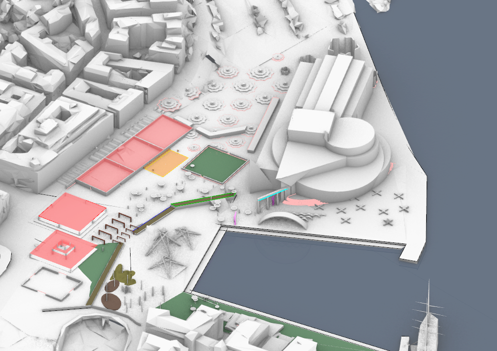
The first design lands on site. One of the first things that needed to be accounted for was the sheer scale of the space. When developing the sketching method a smaller scale of the spaces that the models inhabit was imagined and it became clear that some of the models worked better than others in a bigger scale. For example, the octagon extrusions (highlighted in yellow), can easily be adapted to a space by the number of pyramids. The size can also vary depending on the function, for smaller octagons seating might fit, and bigger ones can be used for urban farming.
The blank spaces in-between the models will also need to be filled when recreating th the patterns from the first sketch. The technique work when putting the models together, however many of the models from the sketching technique will need some more alterations in order to function with any other goal than creating different kinds of movement in those defined spaces, disregarding existing objects on site.
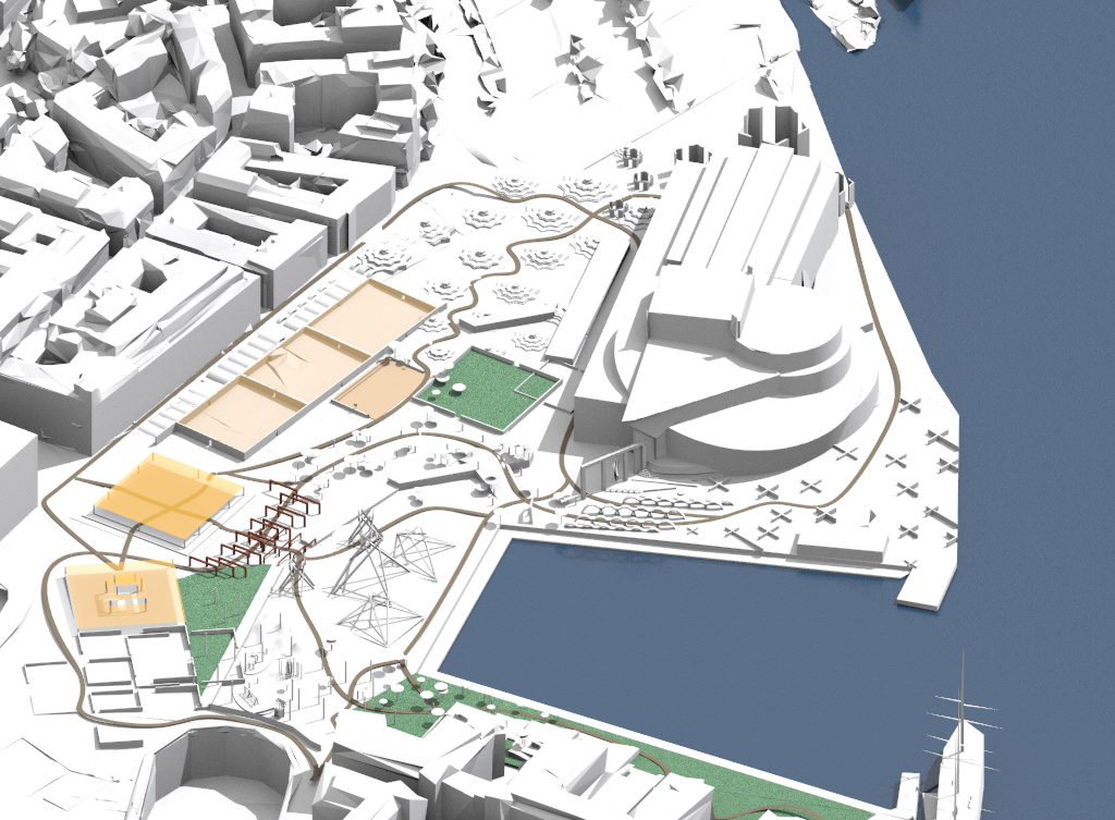
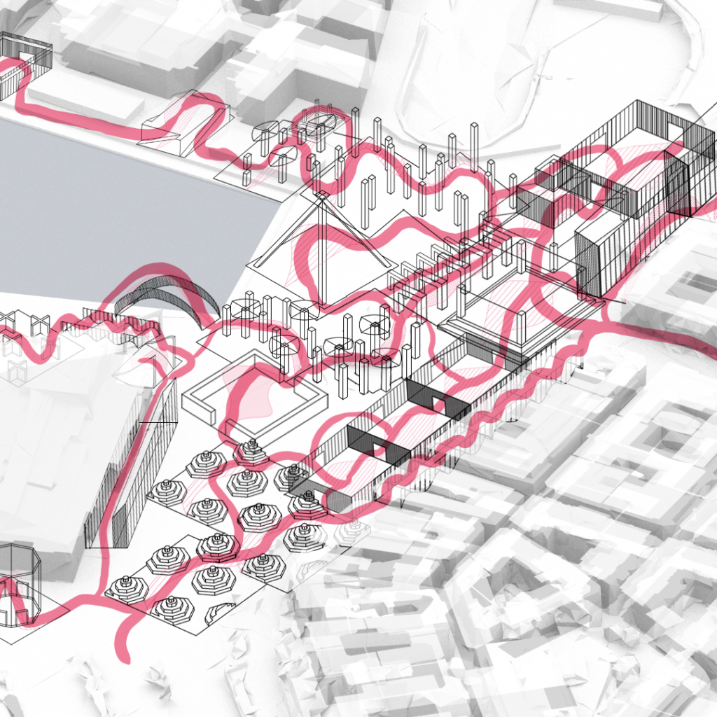
The sketch gets reworked. The models from the sketching technique are altered at some places and multiplied. This fills in the voids but also crashes sometimes with the existing objects on site. Since the first design was completely random, there are now more consideration of placement so that one can keep the intended movement but also use the space in a realistic way. In this design, there are some new goals. Three intention points are made, objectives one might say, that will work gravitational towards specific audiences. This makes it more plausible to try out the methods in a smaller scale.
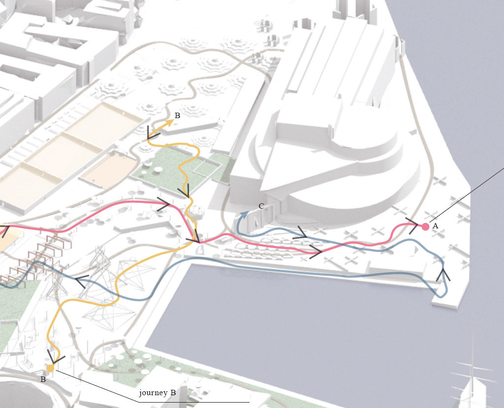
Three intention points are made, objectives one might say, that will work gravitational towards specific audiences. This makes it more plausible to try out the methods in a smaller scale.Three journeys are traced to their respective objective. It should be easy and effortless to move in between the three points, so you should never feel lost in a bad way. But the opportunity to walk astray and be lost, in a good way, should be present at several points through the journeys.
In this web version, one of three journeys will be shown in a cropped version to fir the format of the web page. For the other two journeys as well as a more in-depth analysis and explanation of how the tools were used, see more in the booklet that can be downloaded on page 1.
The couple
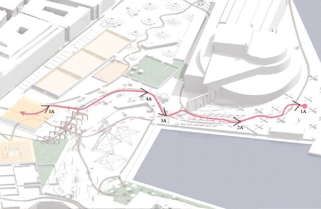
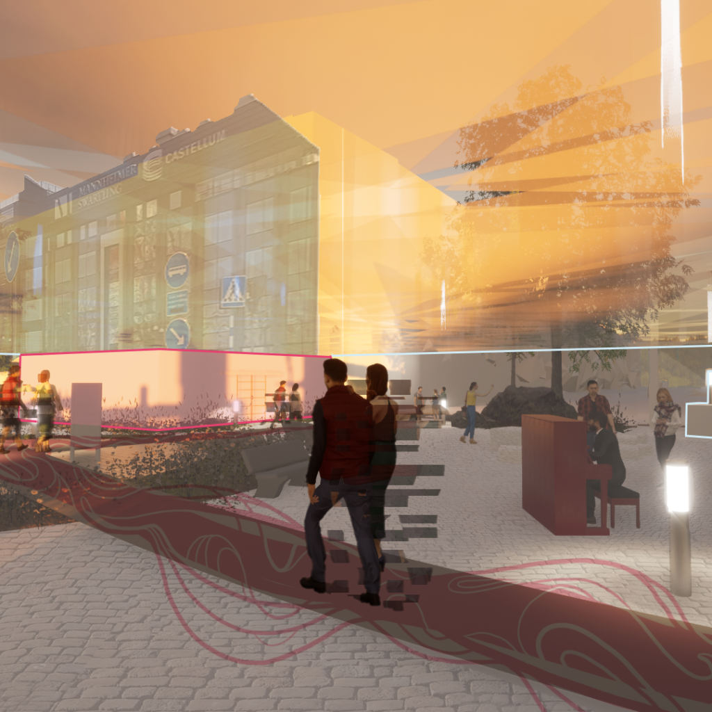
1A. The first journey we follow is a couple as they walk toward the tram stop after spending an afternoon at the bar that lies at the end of the pier. They live in the city so they know the way, but they’re not in a hurry and stop by the open space where a food truck have parked.
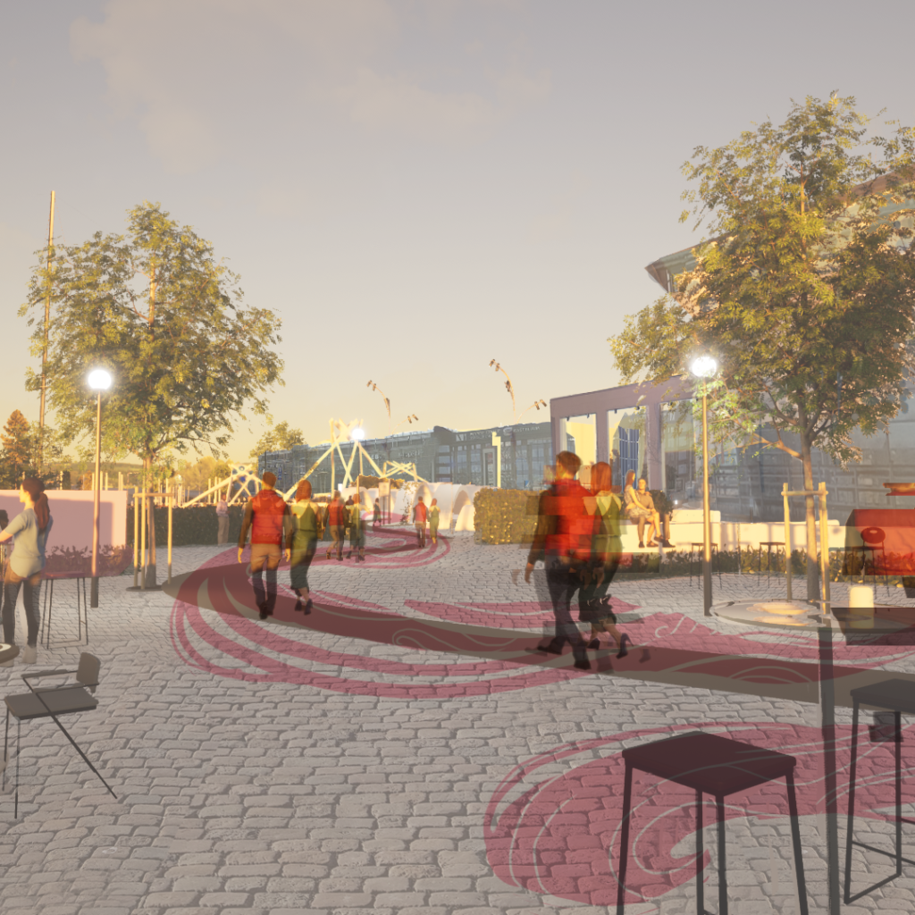
2A. Passing the wavy structures, they walk on one side each, still being able to catch glimpses of the other through the structure before meeting up on the other side at the crossroads.
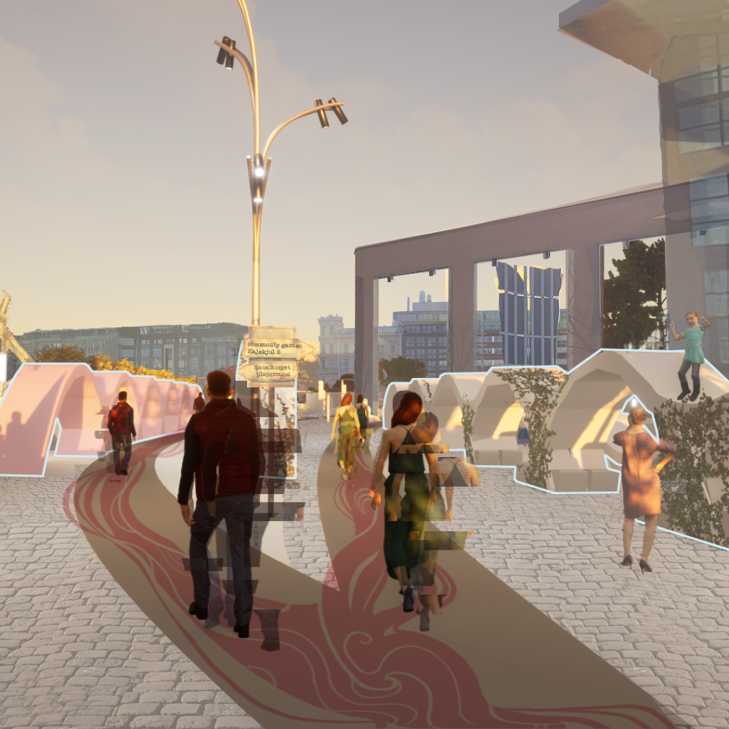
3A. The extrusion create a dynamic change of pace, as well as contributing to curiosity as it partially hides the mushroom structures on the other side so they chose this path.
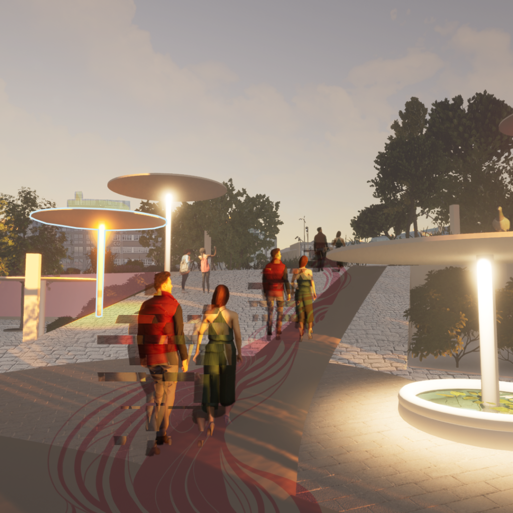
4A. They pass the pocket park and ballpark to the right that are popular hangouts in the evening for adolescents.
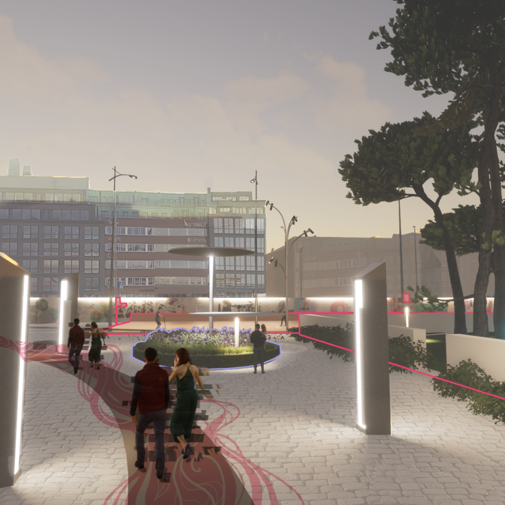
5A. Their final stop is Kanaltorgets heart, which lies at the official entry to the area, a sheltered meeting place with a convenience store and places to sit. It also has space for street artists, maybe when it rains.
Reflections
Overall, it worked well to apply the toolbox to the site. It created spaces with shapes that directs the movement in a non-coercive way, giving plenty of options to walk astray during your journey through Kanaltorget. However, as discussed before, it would have been smoother to assess a smaller space for the final design, or maybe several smaller spaces.
The sketching technique can also benefit from adding more models that fit within the different kinds of movement, providing more choices when designing.
The randomness of the design also came with it’s own set of pros and cons. While it did create a design that would not have been thought of otherwise I think, as well as generating random qualities, like the wavy structure being used both as a space divider as well as seating or for climbing. The Mushroom structures works both as lamps and as shelter, and depending on what material you use they can probably serve more uses.
Looking at the wider picture of applying the method more systematically there are some issues that pops up. The tool gravity does somewhat rely on people having clear objectives and planned paths to take. To be able to be distracted from one path, an original path must have been intended. Furthermore, an object or place that would have a very high attraction for one person might be completely uninteresting for another. It can be problematic to apply on a bigger scale because there are so many possible objectives in a city. On a city scale, it would certainly come down to categorising many peoples taste and preferences into a few groups. This can still be usable to see where the city lacks gravity points for different groups of society, as well as where we can create more interacting and dynamic urban environments. As a next step for evolving the design method there would be an emphasis on how to more precisely apply the gravity method which I think is a crucial part of the whole toolbox.
Finally I would say this toolbox do generate design that create spaces as a result of movement rather than having movement be a result of spaces.
