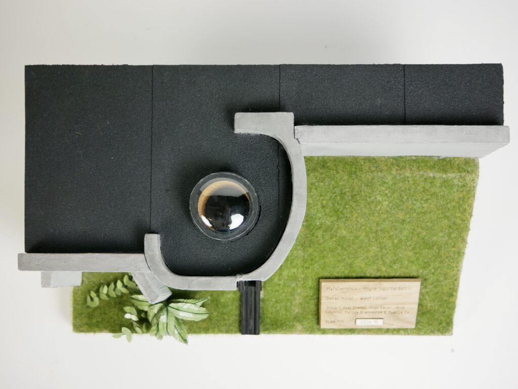
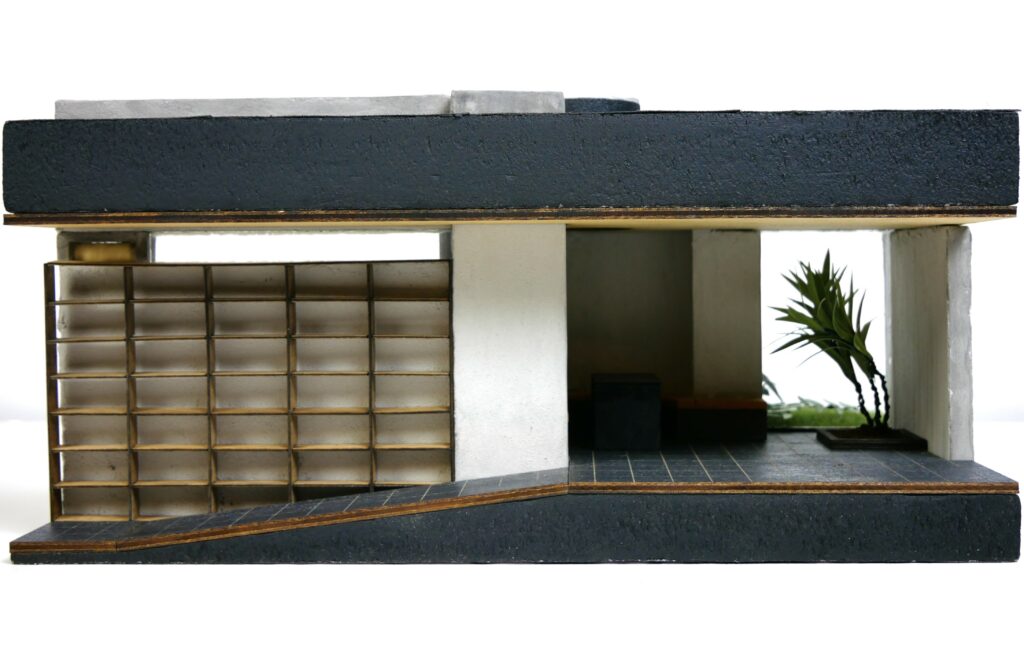
Detail model
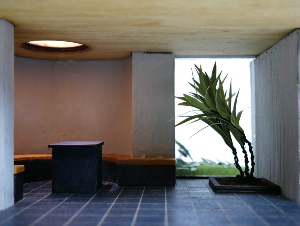
Scale: 1:25
Materials: XPS-foam, wall filler (plaster), plywood, plexi, sanding paper, heat treated PET-plastic, static grass.
The intention of our detail model was to represent three things; the relation to nature, the materials and the contrast between straight brutalist angles and more organic shapes. The scale 1:25 was chosen as a suitable middle ground between overall size and wall thickness, in case we would have casted it, as well as capturing some details such as a bookcase.
Relation to nature
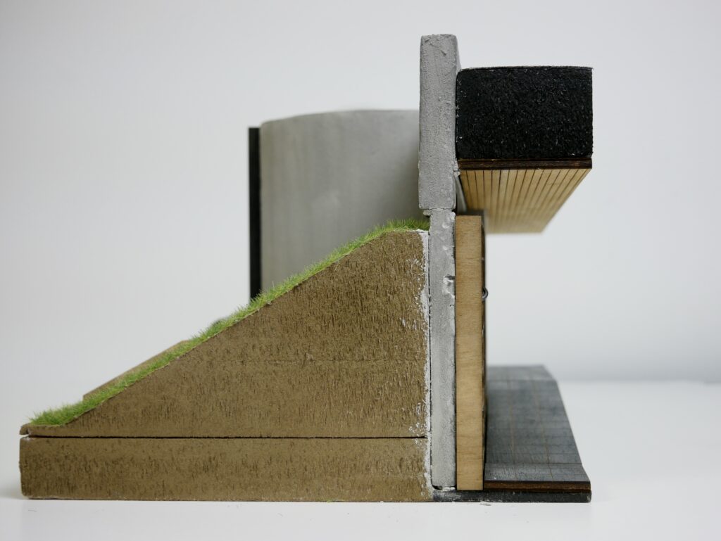
From this model we got a deeper understanding of the building’s relation to its surrounding grass covered soil hills – a modernist take on Icelandic vernacular building tradition where integration with the topography was a way to isolate against cold weather and to protect the building from strong winds. We specifically chose to make the cut through a hill, to exemplify the height of the soil and grass and towards the wall, and the dug-in experience with the difference between height of soil and interior floor. However, when studying the finished model we realized that the windows and doors are placed in a way that, at least in our model, doesn’t reveal the soil hills from the inside. Thus the “dug in” feeling we were expecting didn’t shine through as much as we first thought.
Materials
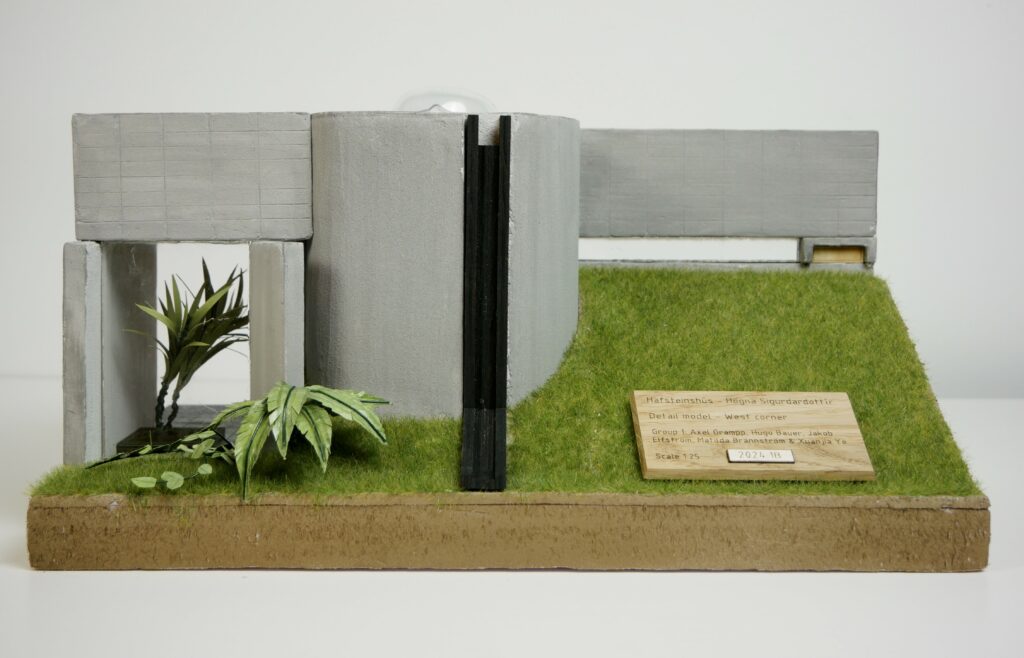
The raw concrete material very much defines the exterior experience of our building. We strived to achieve the same sense of solidness and to some extent harshness, as well as the contrast between the outside and warmer inside. To represent concrete, we experimented with casting in styrofoam, and covering XPS with wall filler, which ended up being the chosen method. This solidness is central in a brutalist interpretation of traditional Icelandic architecture with, in this context, more modern materials such as concrete. The contrast between inside and outside comes from both the dug-in nature of the building, but also from the materials. Raw concrete is not dominant on the inside, but instead the warmth of the darker stone tile floor, wood ceiling and built-in furniture.
The many different window types represented in this model (the spacious window on the façade, long narrow window above the bookcase and dome on the roof) brings rich changes of natural light and shadow to the interior space, and also provides opportunities for daylight and leisure viewing. We can also see that the architect has planted greenery on both sides of the big window limiting insight and preserving privacy.
Shape
The chosen part of the model also features a prominent example of how the brutalist rules was challenged by adding more organic inspired shapes, which here is a rounded wall creating a seating area with a table in the middle. This mix of styles possibly stems from Sigurdardottir’s classical academic background from Paris, or possibly the “female touch”, as often mentioned together with other woman architects such as Zaha Hadid, an obvious representative of organic shapes in architecture. For us to achieve an accurate and organic shape we made all the walls with styrofoam or XPS in the CNC wire cutter, before cladding them with wall filler.
