
The space in the factory is currently not being used as efficiently as it could be. Since different parts have been renovated and adapted at different times there has not been an overall picture for the building as a whole. It has resulted in some unique (and not very space effective) solutions and several tenants’ spaces being divided on multiple floors. If the space would be structured in a more general way and be redesigned at the same time the current tenants would not need the whole building. A reorganization would therefore free space for an additional business that would add qualities both to the current tenants and for the area as a whole. The block is currently dominated by dwellings and office spaces. Unless you live or work there, it is unlikely that you would have a reason to go there regularly. To change the dynamics of the area and to invite people to experience the historic site, a part of the factory building will be transformed into a business that has a large flow of people and is activated all day and every day – a hotel. The choice of function refers back to the monopoly’s strong desire to take care of their employees since every hotel is very well aware of that satisfied and happy guests are vital for success. Apart from adding a brand-new function to the building, smaller changes are made that benefit both the current tenants as well as the general public. Places where hotel guests, visitors and tenants can meet each other are created and architectural qualities that has been lost through the years are recomposed.
The portal building that connects the factory’s two gables to each other is not being replaced as the local plan suggests but kept in its current shape with a few minor changes. Even though it has been partially redone several times over the years the greater part of it is original from when the factory was built and would be a shame to lose. To replace it with a higher building would disfavour the courtyard and the factory’s interior spaces in terms of light and views. Supplying it with its own internal stairwell results in that the differing ceiling heights not being an issue and therefore not a reason to tear it down. The courtyard in the middle of the building is currently being used as loading area as well as a space for storage. The partially glassed roof that is covering it is not accessible for anyone. The roof is removed to make the space lighter and the yard is remade into a flourishing green garden. The portal building’s locked port is removed and an open passage similar to the original design is created to invite people into the courtyard. This will be the largest of the three entrances towards the south to emphasize the new garden’s role as a core. The two other entrances are retained in their current state but the stairwells behind them can be reached from the garden as well.

Above: south facade.

Above: entrance.
The new garden will be a substitute for the old one that used to be an important social meeting place for the factory’s employees but that is now long gone. The new one will be open for everyone to visit but also focuses on creating possibilities for the existing tenants to easily meet one another on a daily basis, which is currently a scarce commodity. It is designed in three levels where the lowest one is the same as the street outside and the highest one is the same as the building’s ground floor. The lowest level has entrances both to the hotel and to one on the office stairwells. Plants that enjoy darker conditions are chosen since this is the most shaded part. The middle level contains a rose garden as a tribute to the one that used to be outside the monopoly’s head office. Apart from the many flowerbeds there are smaller seating areas enclosed by the greenery. The top level gets the most sunlight and has plantings with both bushes and trees. There are entrances to the north stairwell, the restaurant and directly to one of the tenants. The seating areas are split into clusters to create spaces both for restaurant guests, office workers and visitors.
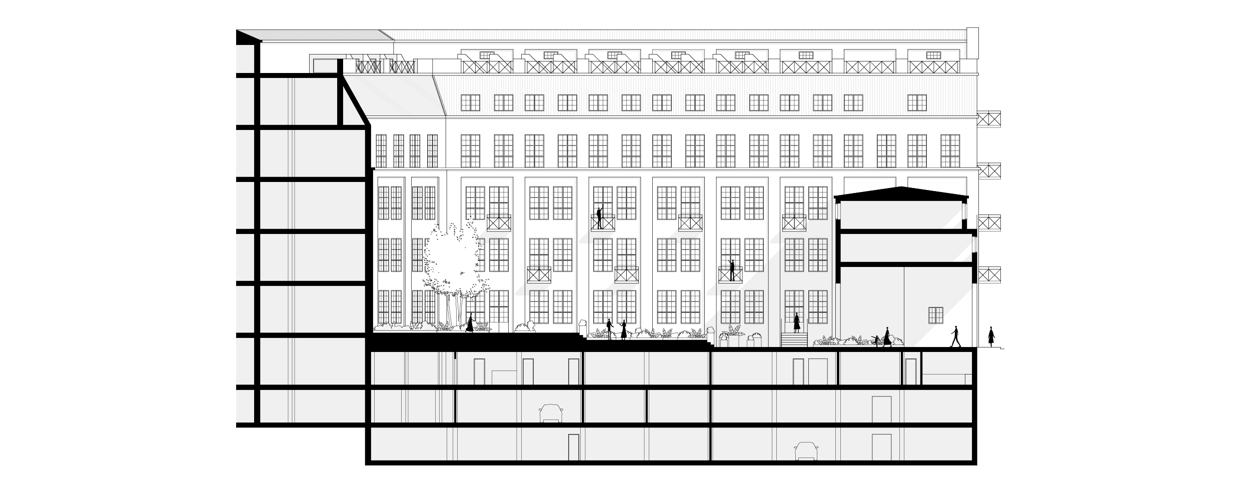
Above: longitudinal section.
The ground floor rooms four of the existing tenants and two smaller spaces that are vacant and can be rented out to new ones. The hotel is placed in the building’s east wing. The hotel reception is accessed either through one of the entrances towards the south or directly from the garden. Behind the reception and in parts of the portal building, staff functions are placed together with a staircase that leads to remaining functions on the portal building’s first floor and in the basement right below. Towards the garden a restaurant with multiple and aligned rooms is placed. When desirable, it can grow out in the garden to increase the number of seats. The kitchen is located in the wing’s darker core and goods are received directly from the loading area in the basement through a service elevator. There are 107 rooms in total in the hotel and eleven of them are located on the ground floor. They are placed along the east facade and the lobby area ties the ground floor’s different parts together. It also connects the ground floor to the upper basement with a centrally located stairway.
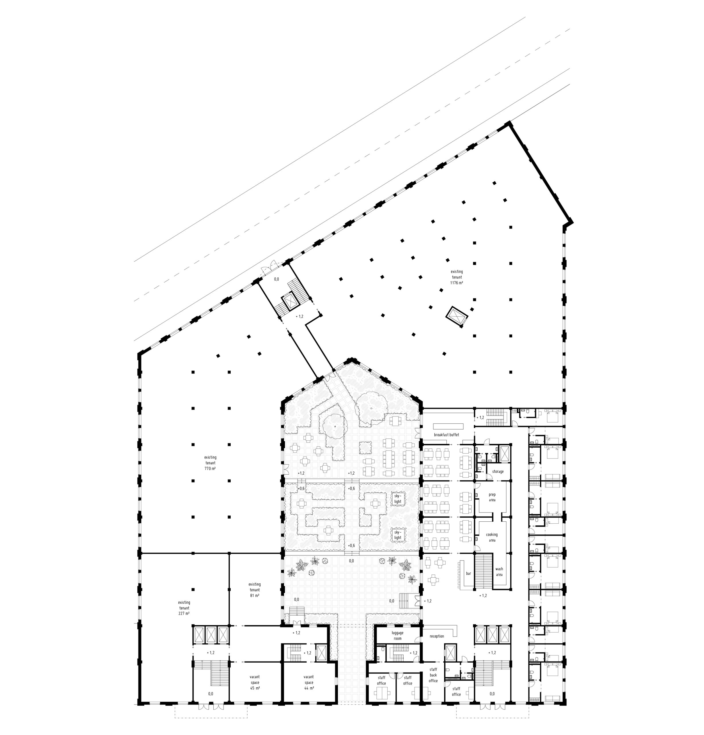
Above: ground floor.
The garden’s different levels are parted through raised plantings on either side of the steps that bind them to one another. In between the two upper levels a more narrow stairway is placed right outside the entrance to one of the tenants to give them a shortcut to the rose garden. To connect the garden to the upper floors of the building balconies are added to some of the hotel rooms and to some of the office spaces. Apart from giving additional qualities to the interior they also bring more life to the outdoor space and more variation to the facade. They are given forged railings with a similar design to the ones on the existing balconies on the south facade. The garden is also connected with the upper basement through two skylights that are placed in one of the flowerbeds with roses. All stairwells are connected to the courtyard to give everyone good opportunities to use it and to encourage this. With that said, the added greenery will not only be a quality that could be enjoyed from the outside but also add value to the interior spaces.
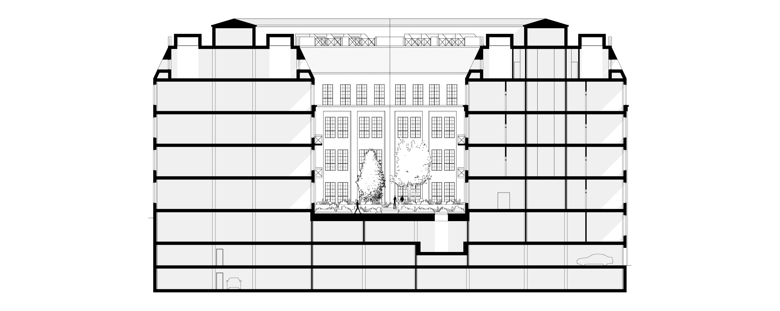
Above: cross section.
The parking is concentrated to the two lowest basements floor to free the upper basement which receives light in three directions and therefore have the possibility to be used more effectively. The southeast corner consists of the hotel’s conference section that can be used both by hotel guests and other tenants. The nine conference rooms ranging in size from 26 to just over 100 square meters are all placed around a lounge that both have access to the lobby on the ground floor and its own entrance. This space can be provided with food and beverages directly from the kitchen through the service elevator in between meetings. Right below the green courtyard a wellness area consisting of a gym and a spa is placed. Just like the conference section, the wellness area is not only intended for hotel guest but aimed to invite a wider range of people to experience and get to know the building. The spa is accessed through its own reception that also connects to the changing rooms. It consists of different areas including saunas, showers, treatment rooms, therapy rooms, bath, yoga studio and a snack bar. Apart from these common spaces the upper basement also rooms two existing tenants.
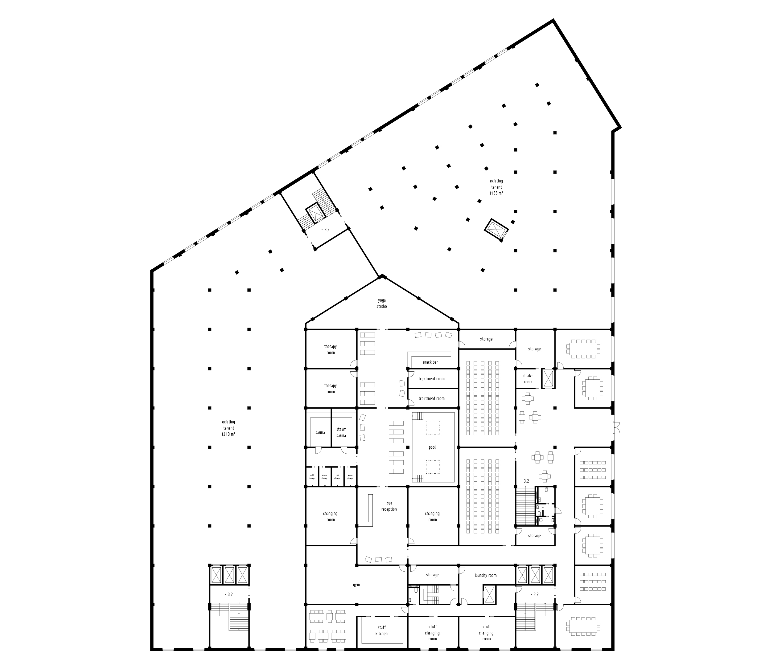
Above: upper basement.
The wellness area can be seen as a tribute and a way to remember the monopoly’s high ambition to look after their employees. The spa offers alternative and modern ways to take care of people that appeal to a large number of people but has the same ambition that the monopoly had regarding welfare and wellness. The part of the spa that is reached first from the spa reception is a lounge area. It partly consists of a 56 square meter large bath over which light is let down through two generous and quadratic skylights. When looking up while having a swim, the sky will be framed by colourful roses since the skylights are placed in one of the flowerbeds in the rose garden. A number of sunbeds are placed in a row along the edge of the water and in front of one of the walls there are swinging chairs hanging from the ceiling to offer alternative ways to sit and to relax. Apart from the spa reception the lounge is also connected to the snack bar as well as the area with multiple saunas and showers through large pairs of sliding doors.
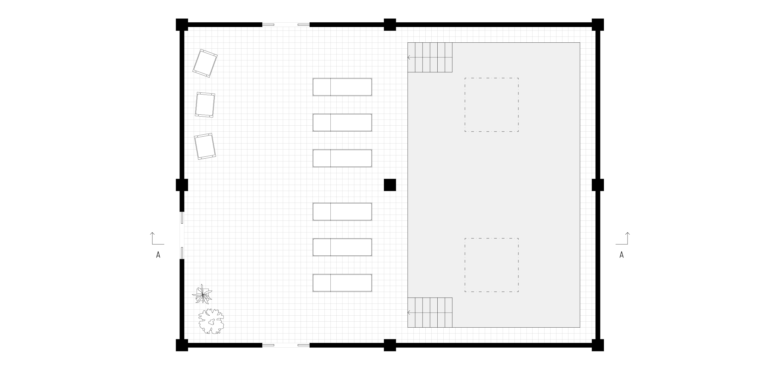
Above: detailed floor plan.

Above: section a-a.
The second floor rooms three existing tenants and the portal buildings top floor consists of a vacant space that can be rented out to a new tenant. The first and third floor of the building generally follows the same layout as the second floor. On this floor the hotel wing is made up of hotel rooms that are reached through a central corridor whose width has been determined by the load-bearing pillars’ placement. By letting these be visible both in the corridor and inside the rooms the original open floor plan of the factory will be easier to imagine. Due to the corridor’s generous size it can be used as more than just a transport distance and be given more functions. It is a place to be social and a bridge in between the activeness on ground floor and the calmness inside the room. The hotel rooms themselves are relatively small and can be divided into three categories; single, double and superior. The single rooms are 12,5 square meters and are, as the name suggests, for one person. The double rooms are 19,5 square meters and are for two people while the superior rooms that range from 26 to 30 square meters have space for up to four people. In common for all rooms is that they do not have much space for socialization since that is what the corridor is for. In the opposite end of the corridor from the main stairwell there is an additional smaller staircase that is a shortcut down to the breakfast buffet, restaurant and the garden.
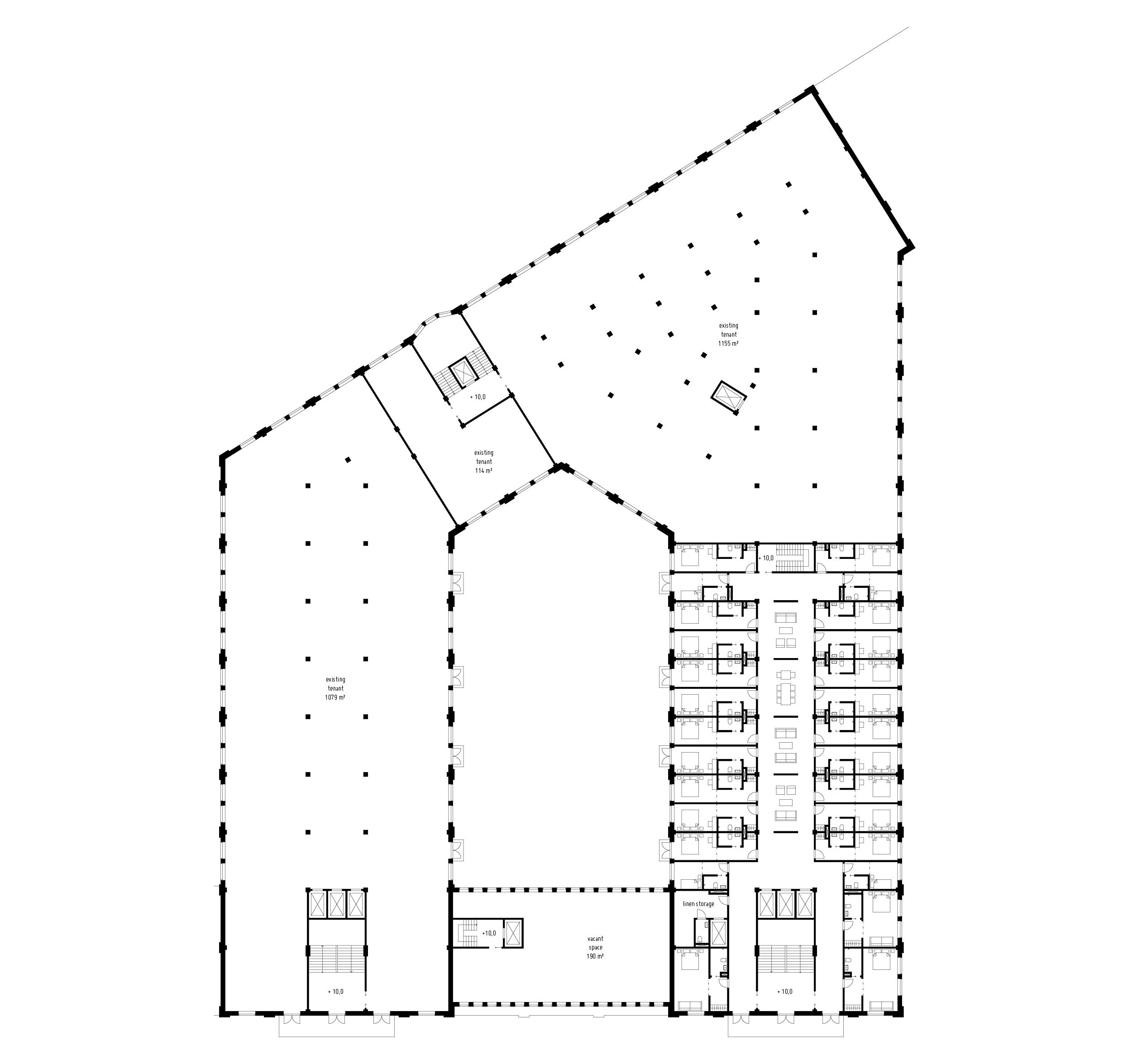
Above: second floor.
Since the double rooms are long and narrow two of them fit in between every pair of pillars. The combination of the four-meter-high ceiling and the large window makes the room feel airy and spacious even though its limited amount of square meters. The ceiling height is slightly lower in the bathroom and entryway to fit installations which also results in that the room open up the further into it you get. Light is let out into the corridor through windows that are placed over the hotel rooms’ front doors. The space outside the rooms is thought to be the scene for social activities with people you know and people that you did not know before. This is possible since it makes it easier to meet other guests from the nearby rooms that you would not have met otherwise. The walls that divide the corridor into parts are decorated with photographs of the building’s time as a factory and of its employees. Both the hotel rooms and the corridor have wooden floors and light painted walls just like the factory had back in the days when the production was in full speed.

Above: section b-b.
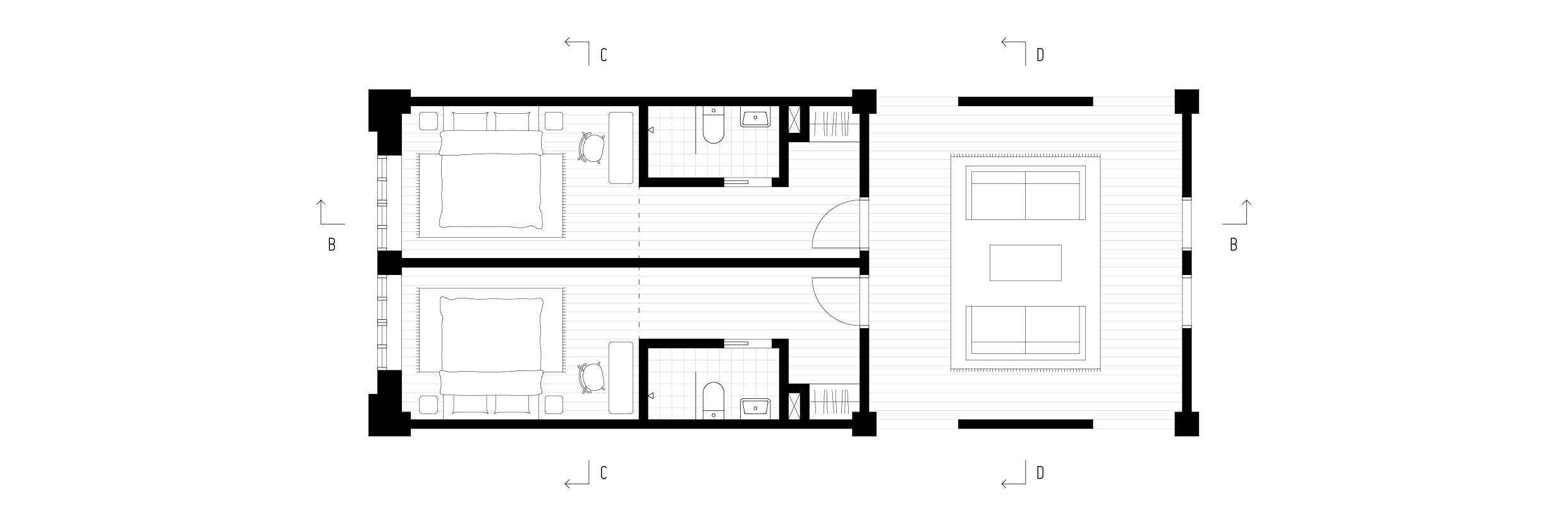
Above: detailed floor plan.

Above: section c-c.

Above: section d-d.
The layout of the fourth floor differs slightly from the lower ones due to the angled roof making the total width of the building smaller on this floor. Besides hotel rooms the fourth floor has three office spaces belonging to existing tenants. The majority of the hotel rooms here belongs to the superior category and have a more quadratic shape than the single and double rooms. Both the tenants and most of the hotel rooms on this floor are given additional value in form of light from above. This is a result of that the roof lanterns, that was almost all removed during the 1990-ies, are being restored. Just like on the other floors with hotel rooms, there is a linen storage with a belonging service elevator leading directly to the laundry room in the basement to simplify the flows as much as possible.
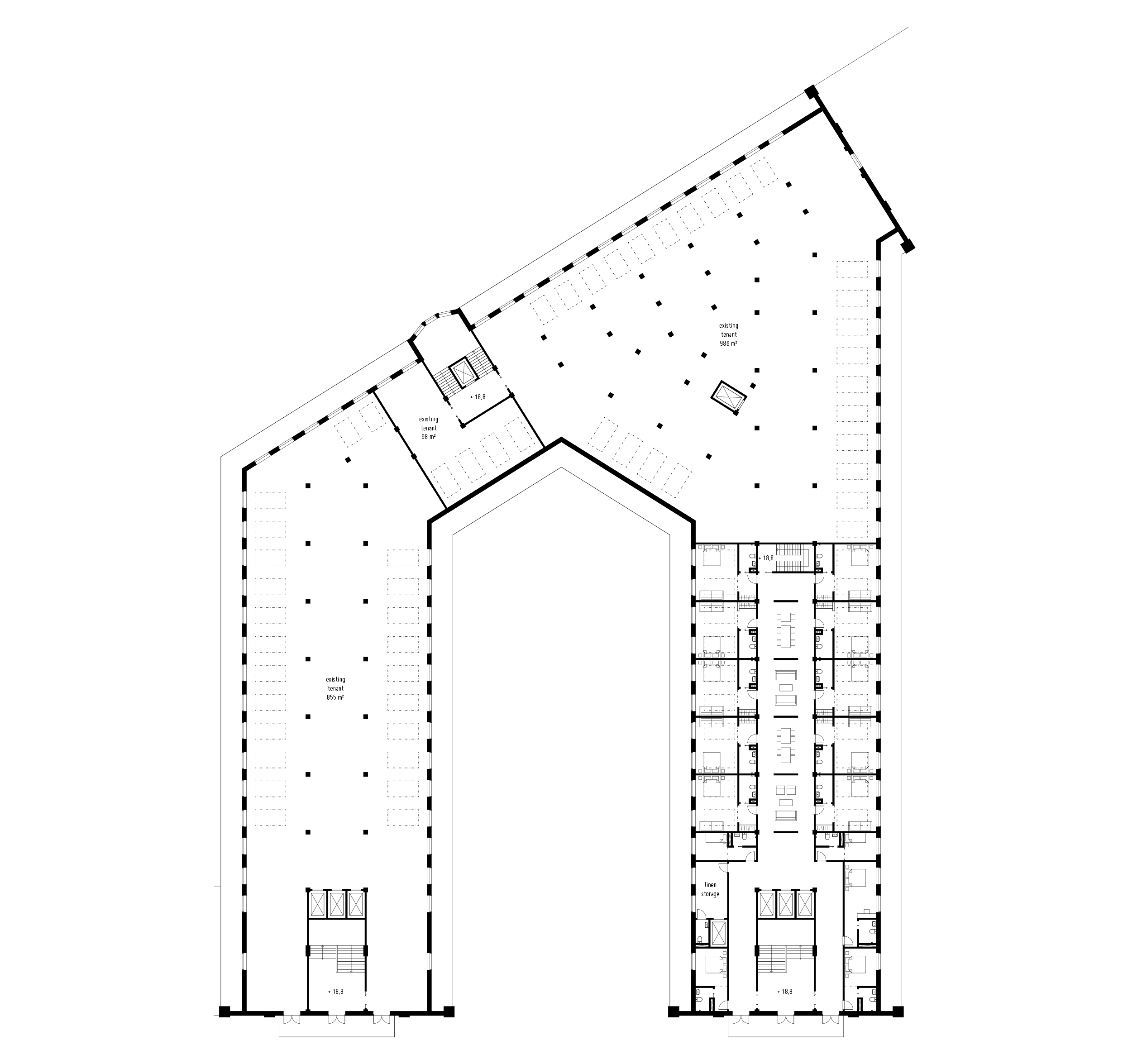
Above: fourth floor.
As a result of the roof lanterns being restored, the total amount of square meters on the fifth floor is decreased. The floor currently consists of mostly technical space but is reorganized to make room for a new tenant. By moving large parts of the technical functions to the two lower basement levels and limiting the remaining part to the west wing a space on the building’s east side becomes vacant. The over 600 square meter large rentable space has a special layout and is connected to two of the three stairways. The windows are placed in between every other roof lantern just like they were originally.
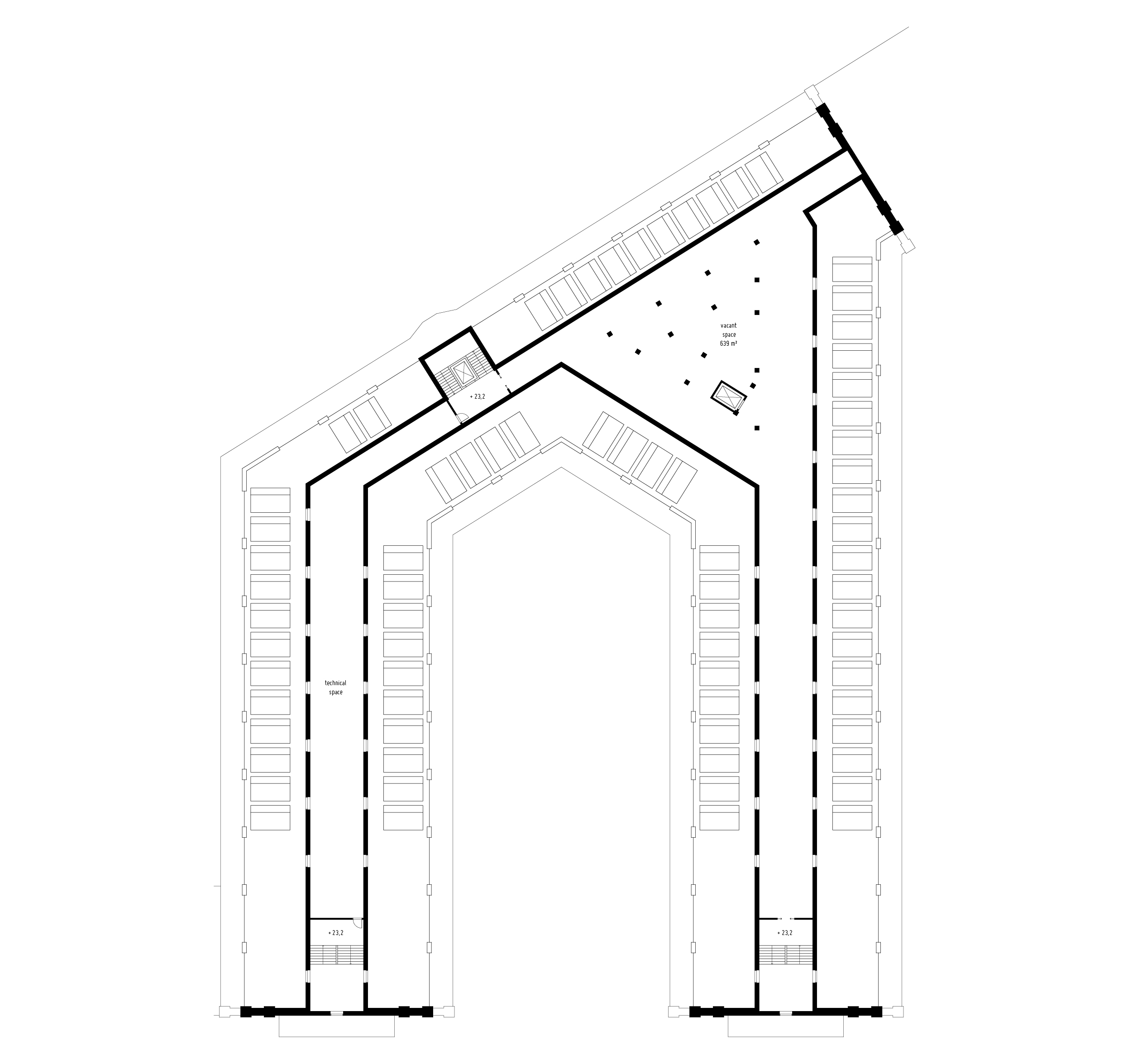
Above: fifth floor.
1: Introduction. 2: The Past. 3: The Present. 4: The Future. 5: Attachments.