Color & Material
At last, I integrated color and materiality to reinforce the effect of physical elements. The site-specific strategy is kept consistent in the choices of colors and materials.
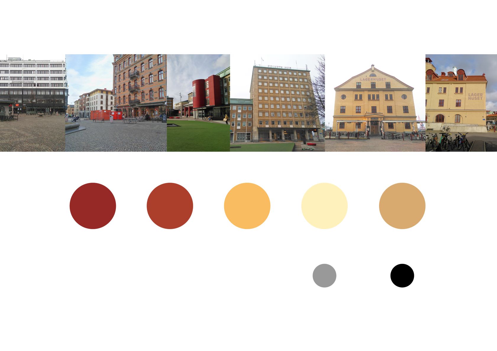
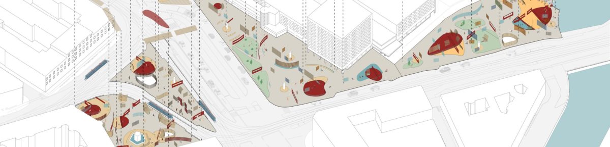
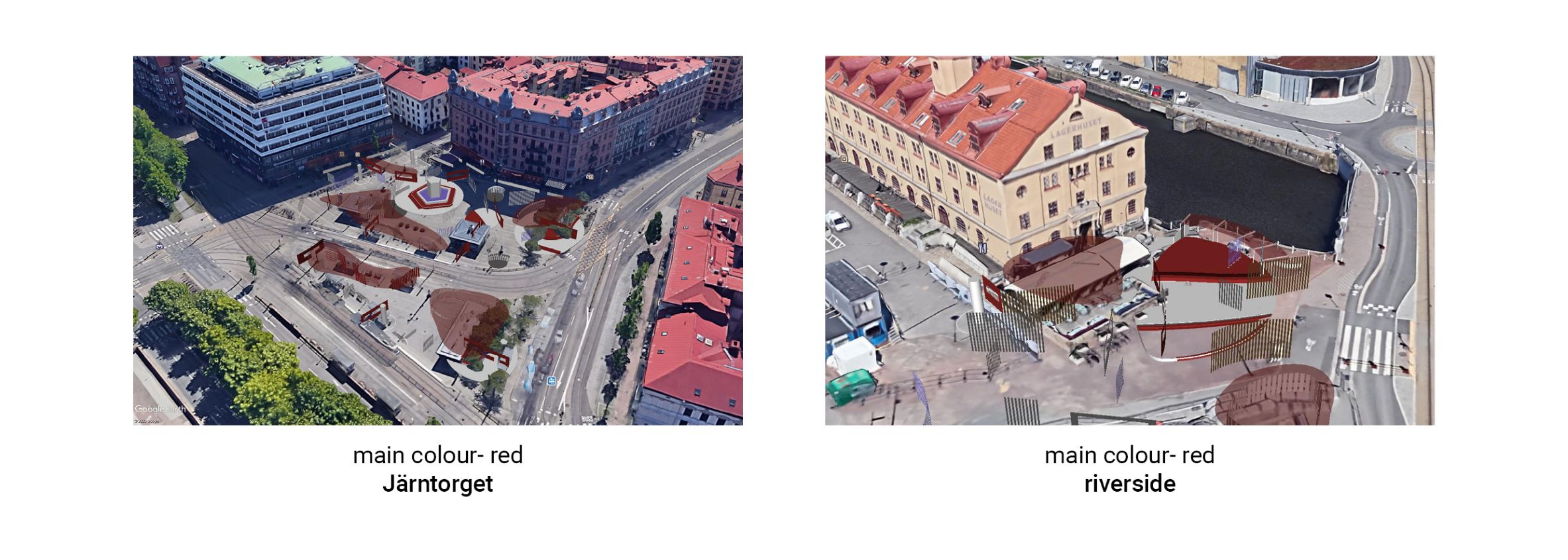
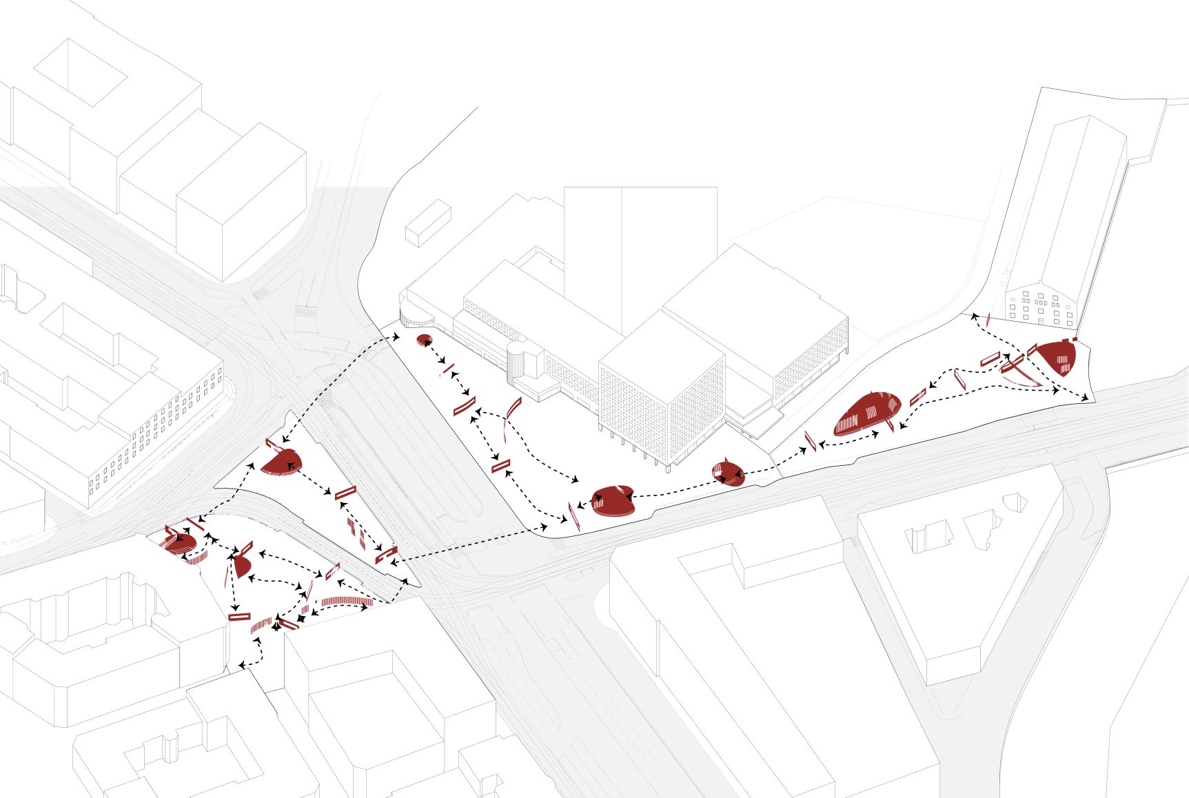
For the color strategy, I used a main color to guide the urban circulations. To have it fit the context, I first got the palette of the context and tested the red color and yellow color on the interventions. The red color functions better since it is similar to the building façade at Järntorget but at riverside has good contrast with the yellow façade. I applied this main color on the elevated part of active nodes and interruptive surfaces.
I then tested the contrastive color that I’m gonna apply for the separative surfaces at different area. At riverside area, the existing context is simple, and thus gives the freedom to the color choices. But for Järntorget and Folkets Hus area, the context is complex and too many contrastive colors should be avoided. Instead, wood color or small amount of calm color is appropriate to give people more relaxed feeling.
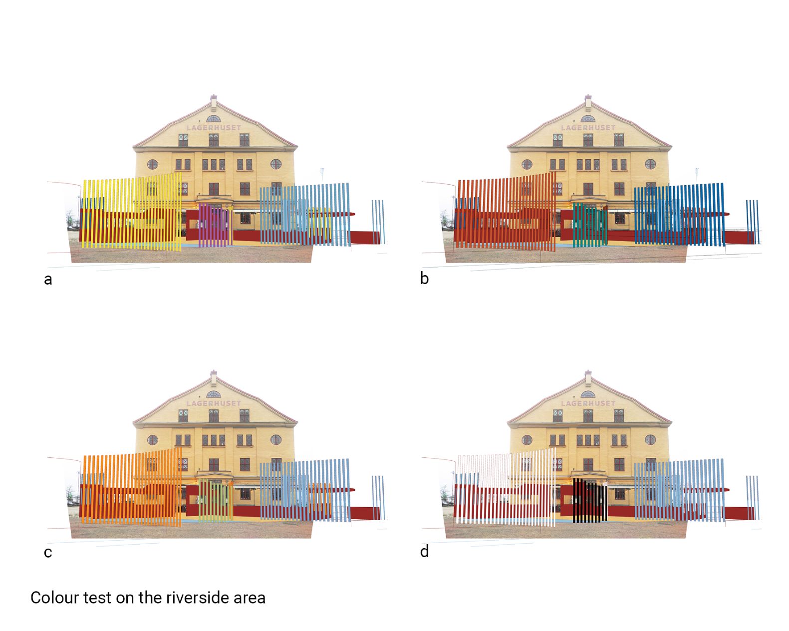
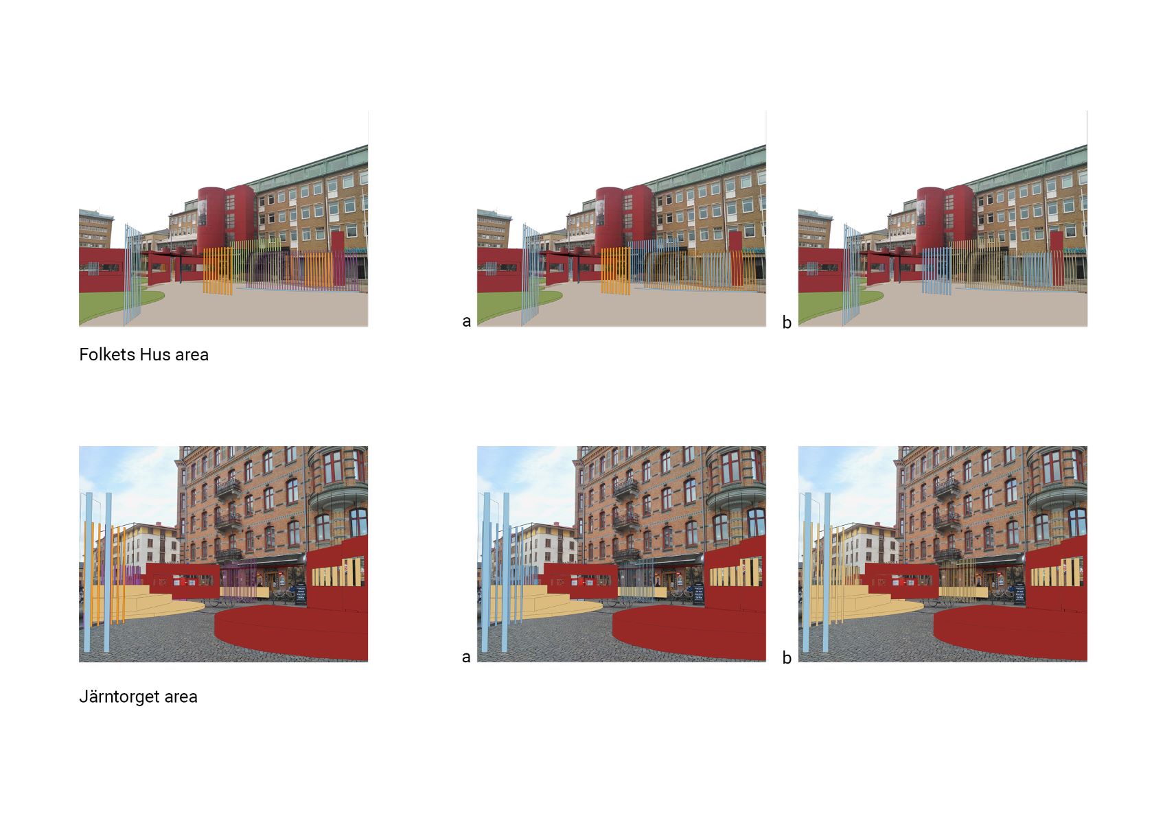
The same for the material choices, to add more contrast as stimulus, I used plastic tubes and metal at riverside area. But large area of wood material at Järntorget and Folkets Hus area to calm people down and imply this invitation and relaxation.
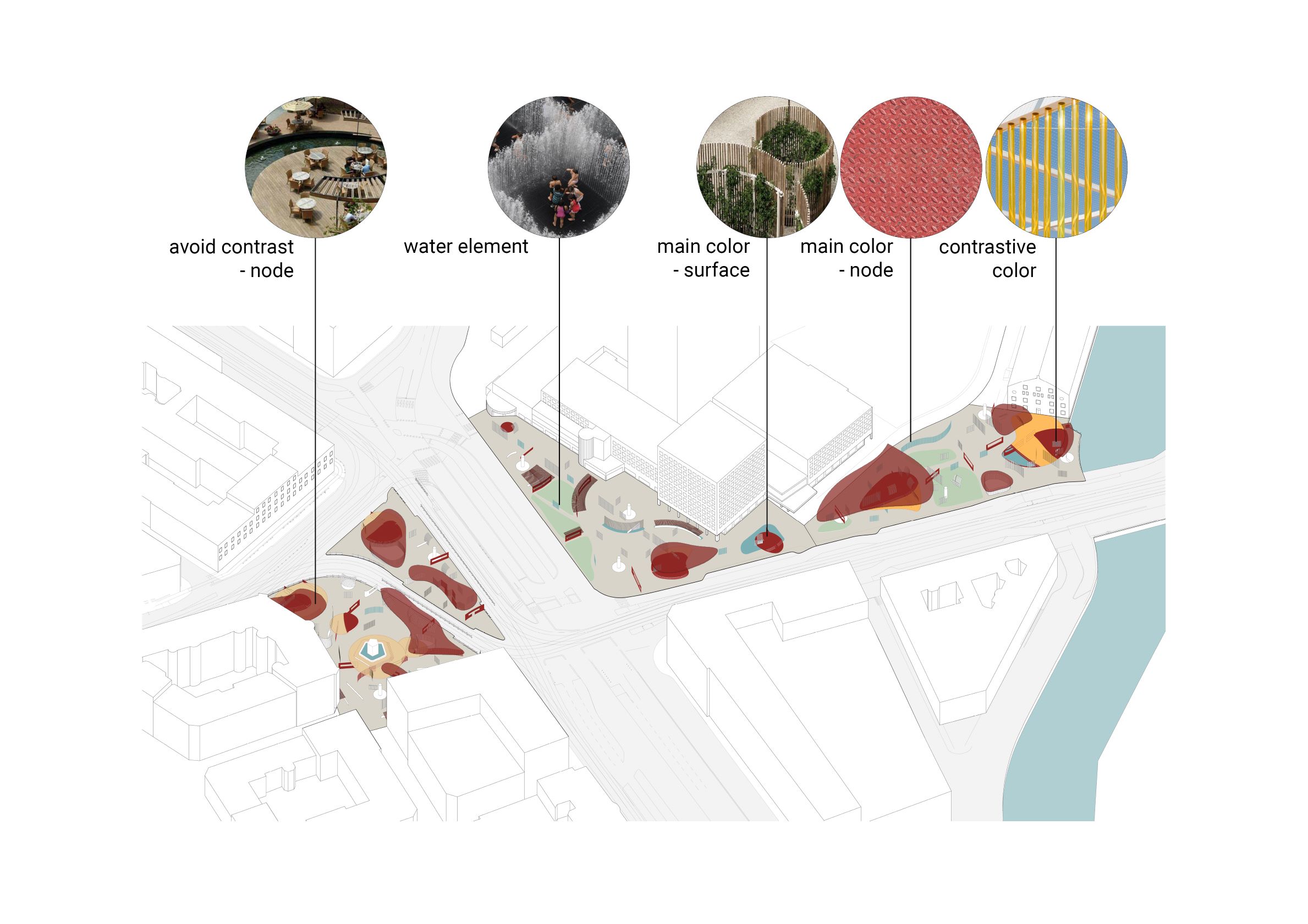
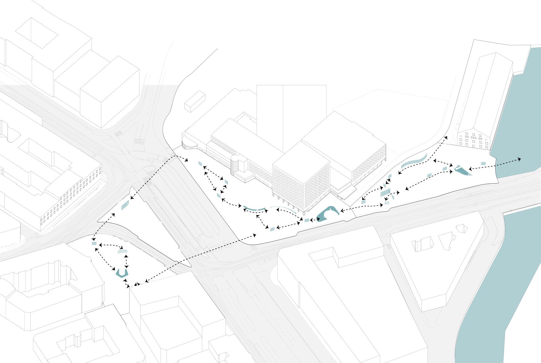
And I also introduced water elements: fountains as vertical surfaces and water pool at active nodes to lead the way to the riverside.