Mapping iteration of the
Halland Museum of Art
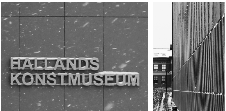
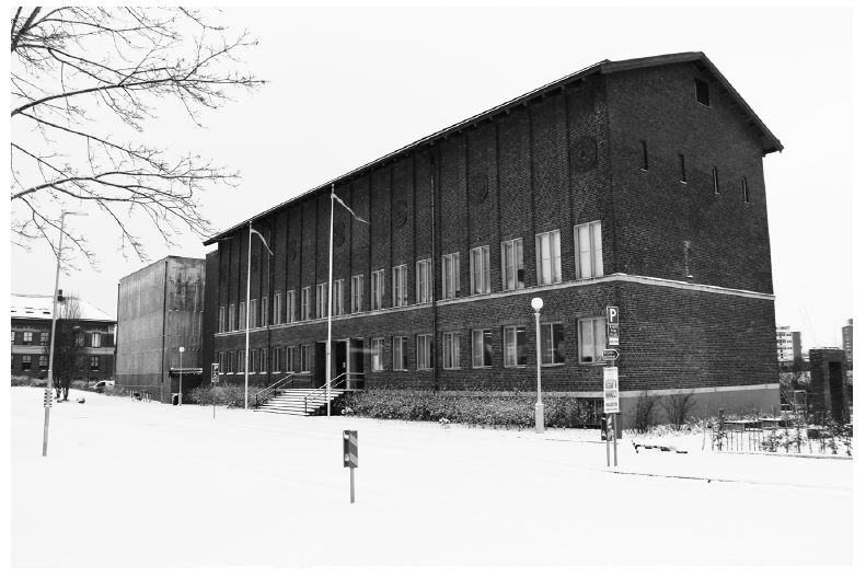
The older brick building has been extended with a newer concrete volume along the street. The main entrance has been moved to the other side of the building, making the street facade the back of the building. Had I continued tha mapping around the building, the complexity would have increased as there is yet another extension on the other side, overlapping both the volumes now included in the mapping.
ORIGINAL BUILDING
Architect, Ragnar Hjort; Year of completion, 1933
EXTENSION
Architect, White Architects; Year of completion, 2019

MAPPING RHYTHM

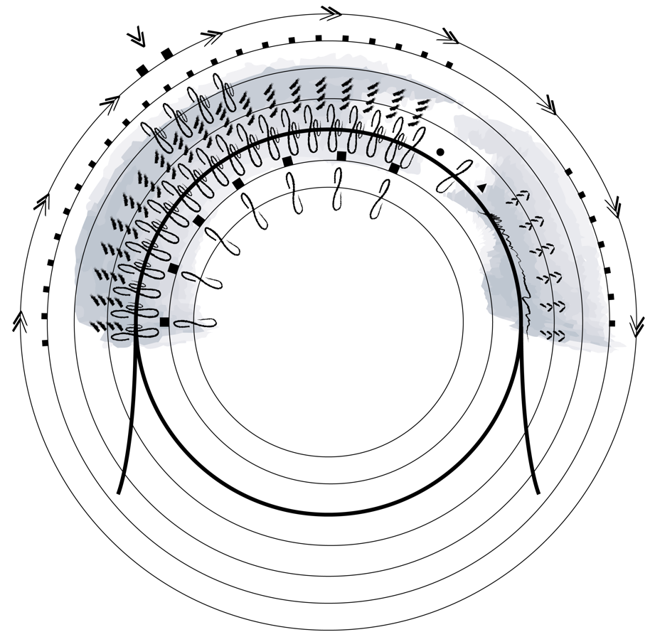
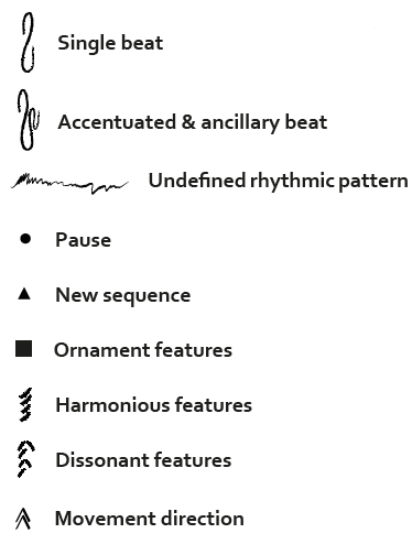
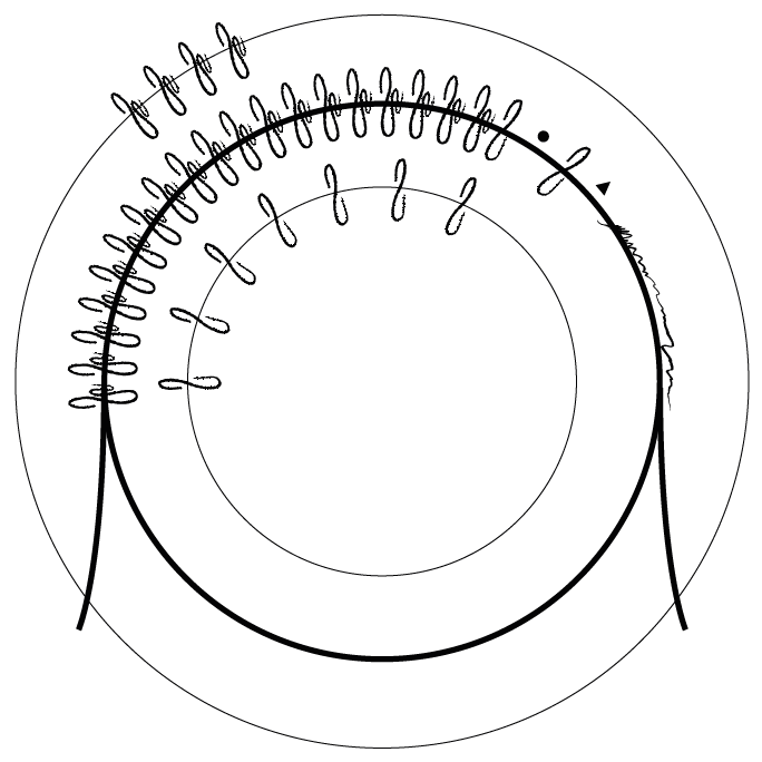
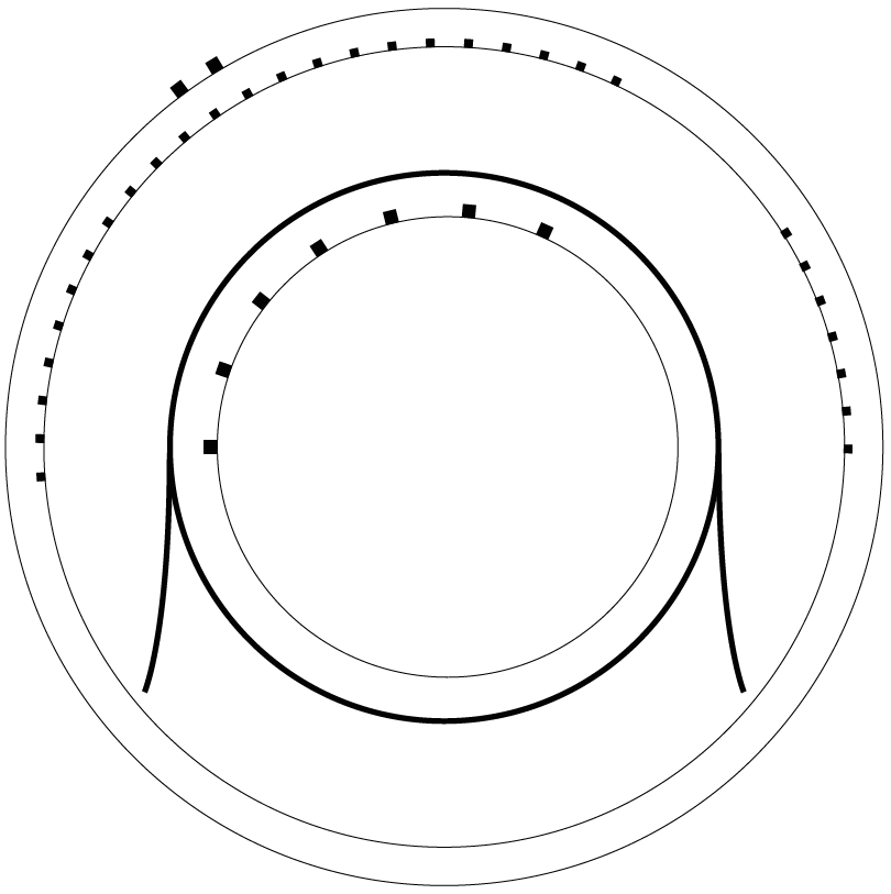
Along the facade of the Halland Museum of Art, rhythm can be experienced in several ways. Most prominent is the accentuation of pillars in the facade of the older volume, which is enforced by the windows. Along the wall, seven ornaments at regular intervals form a rhythm of its own. In the new volume, the windowless facade is ornamented with a rhythmic pattern, but the rhythm is undefined and incohererent in its different levels.


MAPPING HARMONY
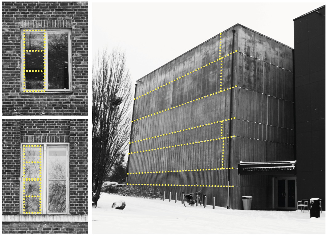
In the older volume, simple geometries like circles and squares have been used, creating the sense of harmony in the facade. The new volume, however, carries some dissonance – but in a good way. While the pattern is constant on each level, the dimensions are uncorrelated to each other both in height and width.


MAPPING ORNAMENTATION
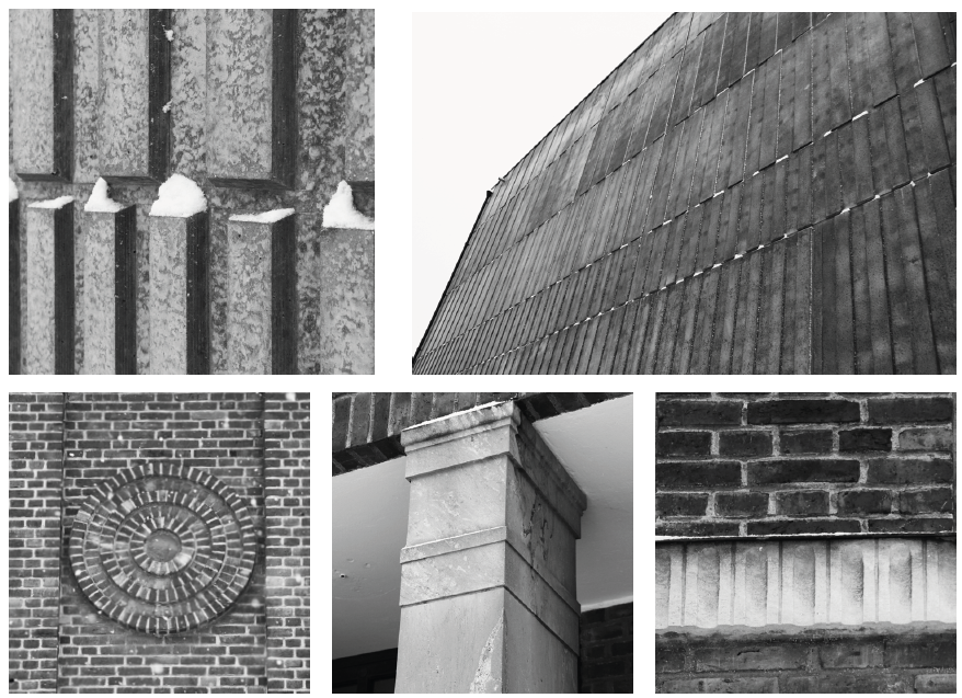
Despite the first glance sparsity of the museum, there are several
ornaments in its facade. In the new volume, the wall is completely
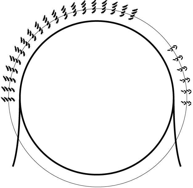
covered in a pattern cast in the concrete elements. In the older volume, there are of course the prominent circular ornaments high up on the facade. The somewhat odd looking pillars marking the old entrance are crowned with demure decorative lines, and the white line that marks the second floor is in fact decor brick work.


MAPPING MOVEMENT
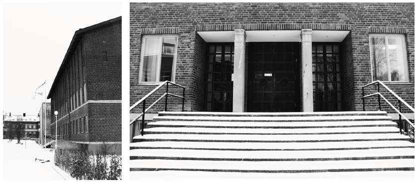
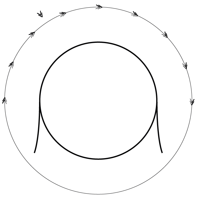
Upon reflection, it is understandable that the main entrance has been moved to the opposite side of the building – the sense of movement along the facade is very strong and rather urges you to move forward than to stop and walk up the stairs. However, there is a newer building in front of the museum, and it is easy to imagine that a very different route led up to the museum in the past. Approaching the building from up front would allow the main entrance to draw the visitors closer through the timid but perfectly balanced staircase.


MAPPING VOLUME
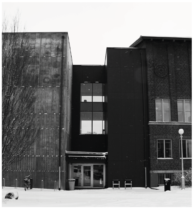
The two volumes, the old and the new, are of equal significance in volume. The newer model is deeper than the old, and it imposes more on passers by, through its placement closer to the street and sidewalk. The eaves of the older volume are in line with the roof of the newer, and they share the same massiveness. The thin connection between the two volumes creates a distance.
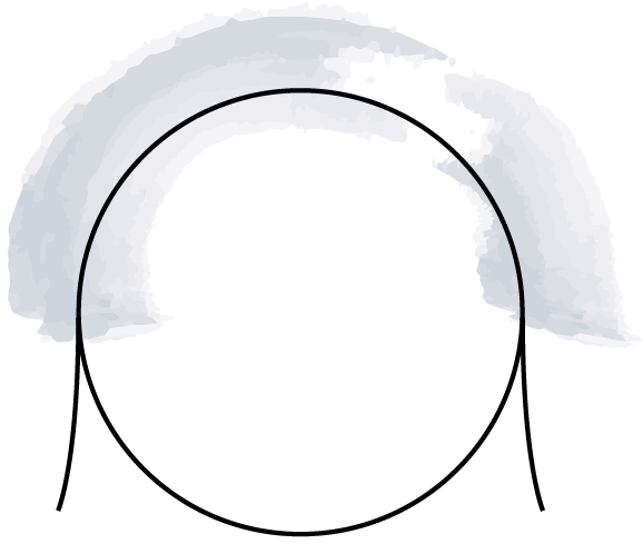

COMPLETE MAP
As mentioned, in this iteration I worked with a circular base to map
the different features in layers. When all five maps are combined, this
is what the mapping looks like. The mapping can now be treated as
notation to create new design, which is the next step of the iteration.
It does not offer any limitations in configuration, material choices,
architectural style, use of the building etc. Only guidance on how to
treat the five features in the shared vocabulary.
